Difficulties with Degrees
In this post we resolve the problem with our US data points
In a previous post we looked in excruciating detail at some point data in the US. After first establishing that many, if not all, were in the wrong place,
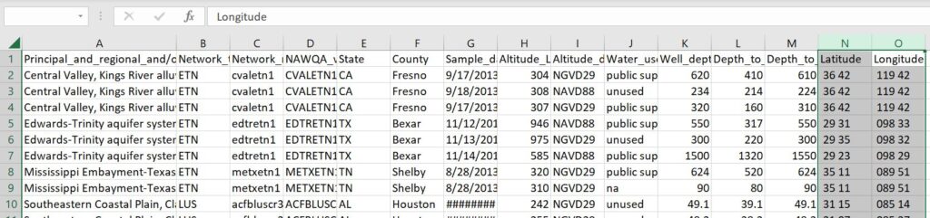
the next step was figuring out how to fix this, which meant getting to grips with why they were not correct in the first place. Recall that when I got these data, their latitudes and longitudes were already in decimal degrees:
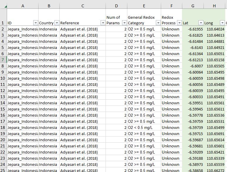
You may recall we mentioned a USGS report on water quality in the last post, the one that had the maps I compared against my points? The raw data for those maps are also available for download as a text tile. If I then open that text file in Excel, I get something like this:
Now this might seem like a pretty minor thing, but let’s look at this affects their positions on the map.
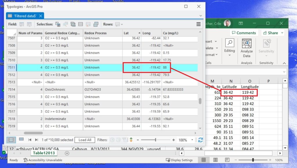
To properly convert degrees:minutes coordinates to decimal degrees I have to do this:
36 + 42/60 = 36.7 (because there are 60 minutes in a degree)
For longitude 119o 42′ translates to 119.7 (and since we’re west of the Prime Meridian, it really has to be -119.7)
So let’s map this point at (36.7, -119.7) vs (36.42, -119.42) and get a sense of how far apart they are on the ground:
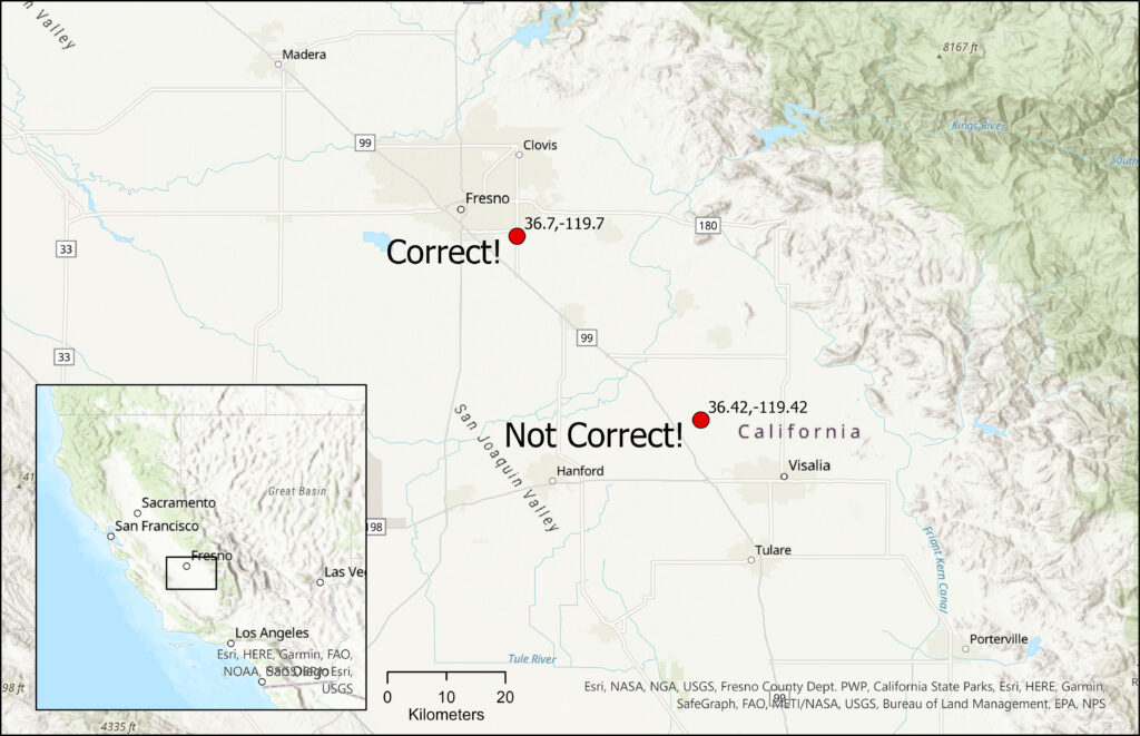
These two points are just shy of 40 kms apart, enough to spark some nasty ownership disagreements between the good citizens of Fresno and Visalia. (Ed. Oh my…that could get ugly…)
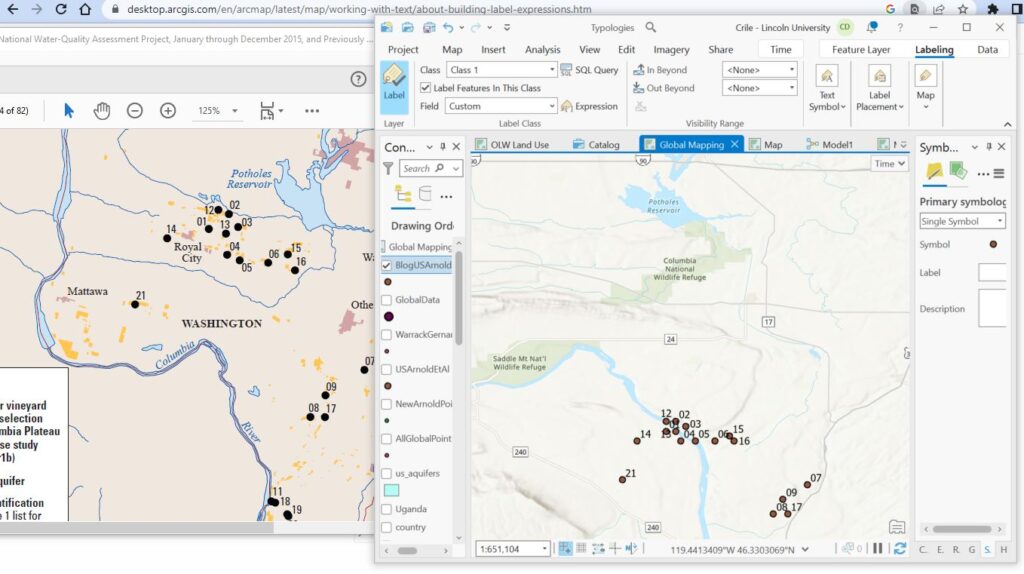
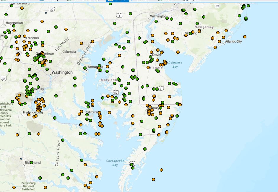
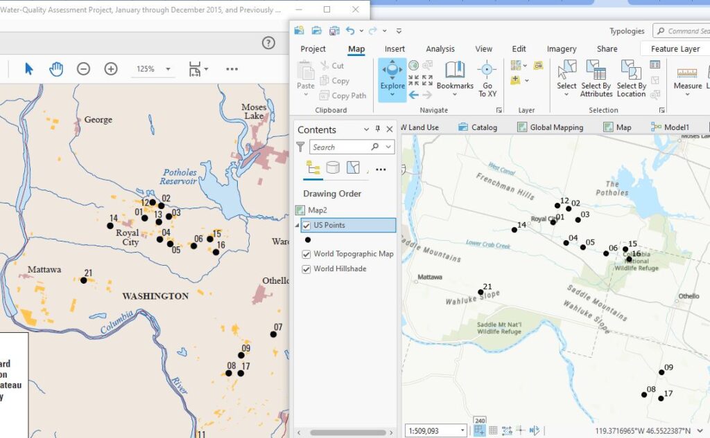
So, how does this get fixed? As a quick summary, I used Excel to first separate the degrees and minutes into two different columns (and had a challenging time where the minutes were less than 10 – won’t go into the gory details on that one (Ed. Thanks)) and then transformed the coordinates for all those points as shown above and remapped them. Happily, this looks to have fixed the problem and all my points now appear to be in the correct locations – a few screenshots to reassure you – new points in green, original points in brown:
With these points now in their proper place, the next steps in the project are around compiling a range of global datasets that have their own issues, some of which you’ll be hearing about in later posts.
C