Degrees of Difficulty
To work through a mapping project a bit of detective work was needed to get data in the right place.
GIS Central has recently been involved with some global mapping as part of an Our Land and Water project. This has involved collating a wide range of environmental data covering soils, hydrology, vegetation, terrain and a range of others (20 variables in all) on a global scale. I’ll admit that this hasn’t been easy in many respects – there are lots of data available but they’re not always in an easy format to work with, or are difficult and time-consuming to get on to a map (Ed. Oh no – does that mean more blog posts about this…?). Perhaps the easiest part of this is that my colleague provided me with a set of points (n = 13,353 from around 20 different countries) to use with this – data from the global datasets are to be attached to each of these points and then used in some statistical modelling. So I thought that part was the least of my worries. Turned out not to be entirely true, especially when it came to the US.
Data arrived in my inbox in the form of an Excel spreadsheet and looked a bit like this:
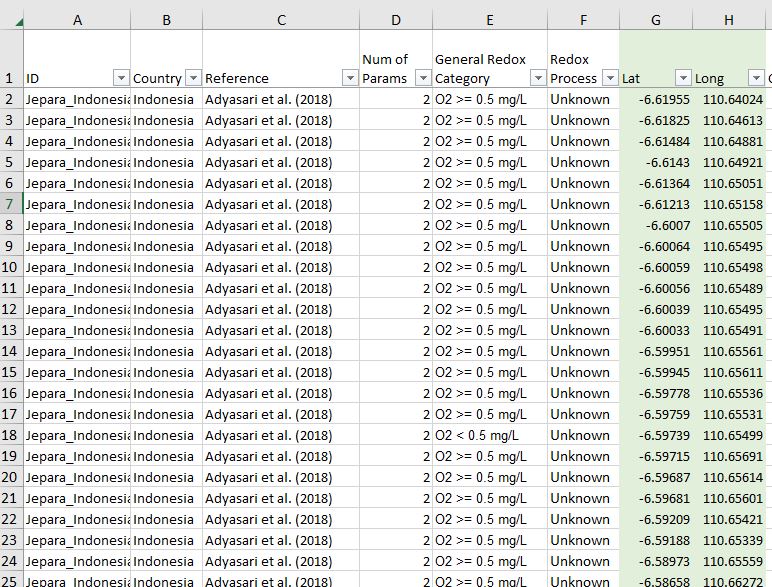
Oh, what fun…! For mapping purposes you can see I’ve got “Lat” and “Long” columns, coordinates for latitude and longitude that allow each point to be mapped, so these are absolutely critical. (Notice, too, that each has a Country and a Reference entry.) First task is to get these on the map.
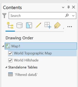
Just like any other layer of data, I can add the specific sheet I need from the spreadsheet using the Add Data button. It appears in my table of contents at the bottom of the stack (“Filtered data$”).
(From Add Data you could also use XY Point Data.)
From here I can right-click the table name and go to Display X Y Data:
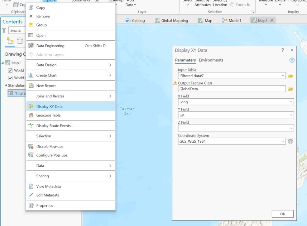
- For this to work I need to know which fields have my X (longitude) and Y coordinates (latitude)
- I also need to know what coordinate system that data are in
- When using Latitude and Longitude, the units need to be in decimal degrees rather than degrees minutes and seconds
That last comment needs a bit more detail as it will become more important later. Latitude and Longitude are often shown in the form of degrees, minutes and seconds (D:M:S) as you might see on your GPS receiver. For instance, Mrs O’s has lat/long coordinates that are approximately:
- Latitude: 430 38′ 35″ S
- Longitude: 1720 28′ 00″ E
For latitude, that would be read as 42 degrees 38 minutes 35 seconds South (of the equator), based on the idea that degrees can be broken down into minutes (60 in a degree) and minutes into seconds (60 in a minute). All well and good but most software can’t easily read D:M:S. A much more straightforward way for computers is decimal degrees. For our latitude we can get from D:M:S to decimal degrees in the following way:
42 + 38/60 + 35/3600 (there being 3600 seconds in a degree) = 42.64305.
Since we’re south of the equator, we put a negative sign in front. In decimal degrees, Mrs O’s location can also be shown decimal degrees as:
- Latitude: -43.64305
- Longitude: 172.46680 (no negative sign since we’re east of the Prime Meridian)
This isn’t quite the same thing as being in two places at once, but it’s close.
For the coordinate system, I know I’m working with data from around the globe so a good choice is WGS84, the system that GPS uses. It’s a good, safe bet but bear in mind that some countries (e.g. the US) have their own geographic coordinate systems (e.g. NAD83) that work nicely in their part of the world – the same coordinates may actually end up in different places, but probably not by much.
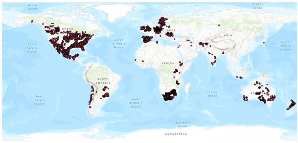
So, setting up the tool and clicking OK gets me all the points, cobbled together from various data sources:
So far so good…until…doing a bit of quality assurance, I found some issues. This QA process mainly involved looking at all the points and ensuring that they were in the country they said they were from and not out at sea or had migrated across national borders.
Most countries looked fine but I noticed some issues in the US (Ed. is that any surprise these days?), specifically, points at sea, and a fair number of them:
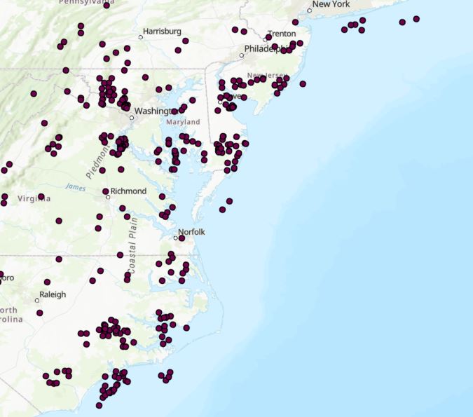
This is a problem. Have the data been somehow shifted too far east? Are they in a different coordinate system? Shifting over to the west coast, no points off shore but they do seem to be shifted inshore possibly?
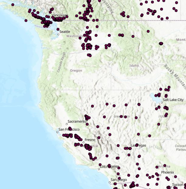
Canada and Mexico look to be well behaved but I remain suspicious of these US data. But at this point I’ve really got nothing to go on. A bit more digging is called for.
As we saw above, my colleague has conscientiously included a Reference column for each data point, so when I selected all the US points, I saw that they all come from the same source – a 2022 publication with an associated dataset. Digging even further, I found that some of the data in that dataset originated from the US Geological Survey, particularly a 2018 report that had some maps in it that I could compare against the mapped points. Looking at my data versus the report maps (on the left below), there’s very clearly an issue and it’s not the wrong coordinate system (I had already tried that). My points are just in the wrong place:
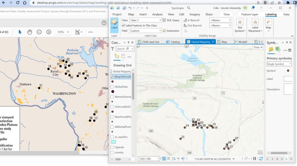
(The maps look slightly different due to different projections.) By the looks of it, I’ve got a national scale problem and If I want to get things right, I’ve really got no option but to go back to the raw data and see where things may have gone wrong.
What we’re dealing with here is data quality, and locational accuracy in particular. If I hadn’t gone in to this level of detail, there are several thousands of points that may get the wrong data attached to them, which will flow through to the final analysis. In all good conscience, I can’t let that happen if I know it’s a problem.
But that’s a job for another day and another post – bet you can’t wait to see how this gets resolved (Ed. Be still my beating heart…I can barely contain myself…[yawn]).
C