Burning the Streams
Here we talk about how GIS can be used to create catchment boundaries and river lines from elevation data.
Far be it from a surface water person like me to advocate for burning streams in any way (we’re not talking about the Cuyahoga River here), but in a geospatial sense it can be a good thing.
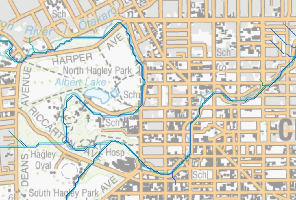
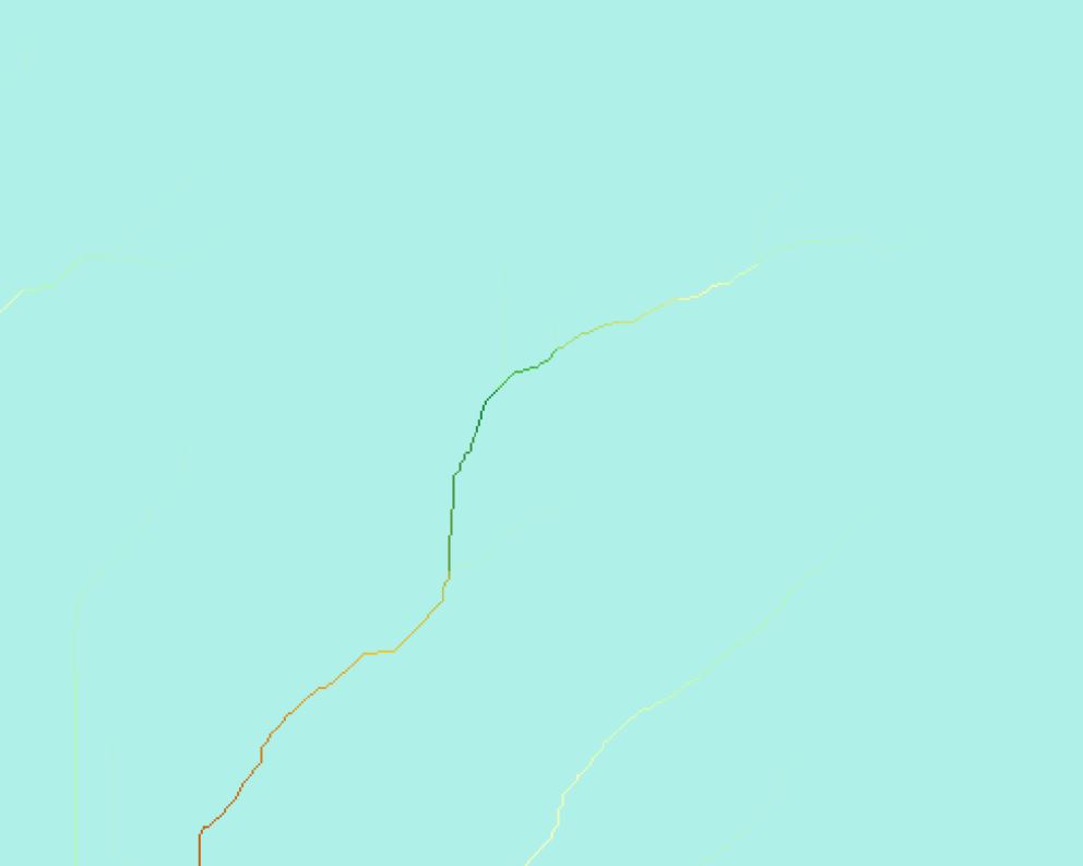
In a previous post we were talking about the River Environment Classification (REC) database – a very useful layer that shows us where the rivers are along with a range of useful attributes relating to the content of their character. One of the things we commented on was the jagged nature of the river lines in this image:
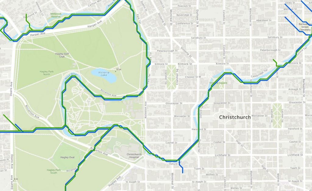
With more detail here:
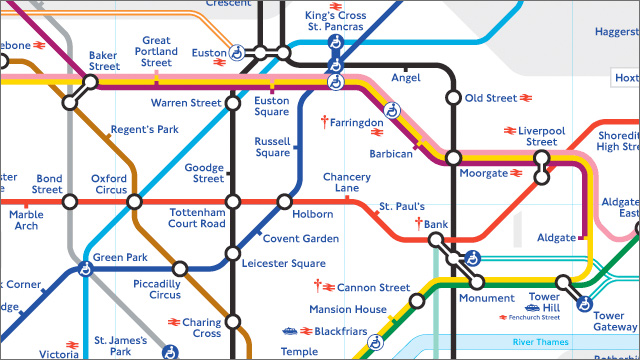
Odd, those angular edges and I’m reminded of the classic London Tube maps were we see something similar – lines are either horizontal, or vertical or an angle of 45 degrees:
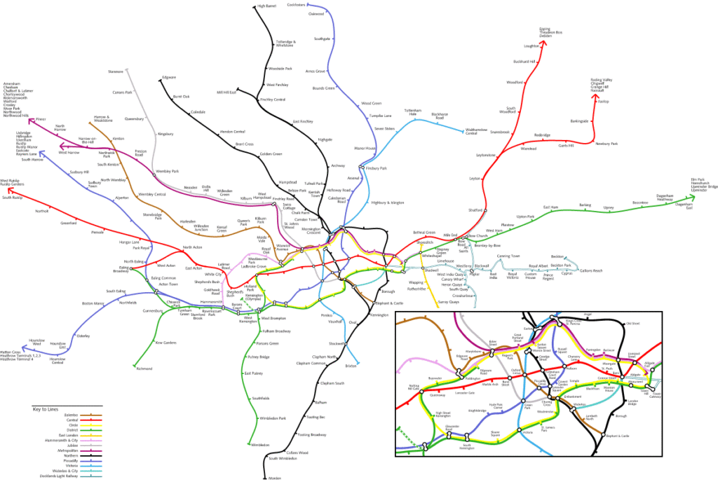
Here we get a few more rounded corners, but still only a limited set of orientations.
(Sidenote: the reality is quite different:
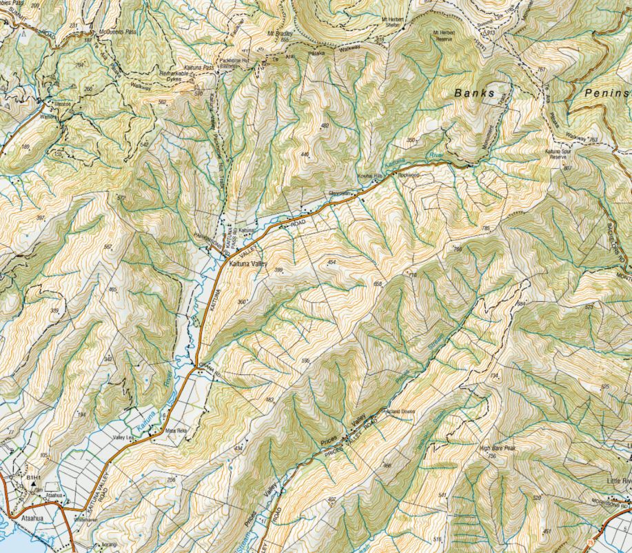
While the reasons for these two being similar are different (Ed. That was quite a mouthful…), the underlying aim was the same: simplification. While I could spend quite a lot of time talking about the Tube map, I won’t here (Ed. Thanks) but let’s look at a good source of “truth” for rivers, the 1:250,000 scale topo maps – here’s the same area shown in the first image above with a lot of transparency to the basemap so it doesn’t overwhelm:
One important thing to note is that the rivers aren’t in the same place. Who’s right? Or perhaps better, who’s closer to right?
One important difference between the river locations is that what we see on the topo map was derived from aerial photos. Some pour soul pored over the images and manually created the river lines you see on the basemap, so they are likely to be closer to the actual locations. (And that pour soul is now either blind, or insane, or both.)
The REC riverlines were derived in an entirely different way, using elevation data and analysis tools. To do this analytically, there’s a well established methodology, colloquially known as “burning” steams into a DEM. There are a few steps in the process and maybe we should start with an overview. The basic idea goes back to the basics of rainfall and runoff on the land surface. When rain falls on an area of land, it can flow downhill driven by gravity in the direction of the steepest slope. Eventually, enough of this water combines in low points to form small streams that contribute all the way up to very large rivers. The area that contributes water to a river system is what we’ll call the catchment (or watershed to you North Americans). We’ve looked at defining this area manually previously but from here on in we’re letting the computer do all the work.
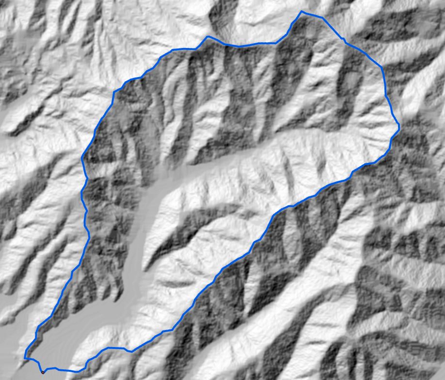
I’ll try and demonstrate this with some data from the Kaituna River on the nearby shores of Te Waihora.
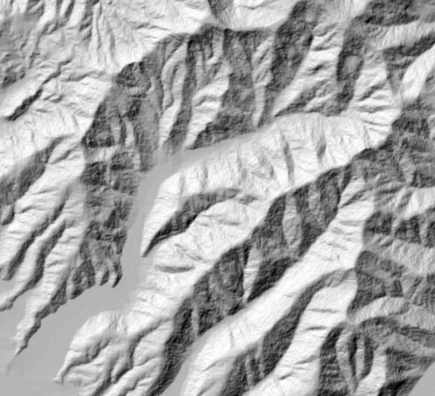
You can get a rough sense of the catchment boundary by interpreting the contour lines and the terrain but that doesn’t get us any closer to lines on the map. To get this part started, we need a DEM and I’m going to use Manaaki Whenua/Landcare Research’s 25 m national DEM, here displayed as a hillshade layer:
Pretty coarse, you might say in these days of LiDAR this and LiDAR that – but be aware that NIWA used a 30 m DEM to derive both REC layers.
Before we go much further, we need to fix some potential problems in the DEM, mainly unnatural holes and peaks in the DEM. (Where did that DEM come from?) Sometimes, as a result of the analysis, we end up with elevation values that are either unreasonably low (and hence would allow water to pour in), or excessively high elevation outliers. We can run the Fill tool to fill up these depressions. Then, the Zonal Statistics tool helps smooth out any excessively high elevation values (using the Mean value). This, hopefully gives us a nice, smooth DEM for our next step – flow direction.
As we noted earlier, water flowing on the land surface tends to move downhill in the direction of steepest slope. Handily, there’s a Flow Direction Tool which explicitly does this for us – it’s kind of an alternative version of the Slope tool and, with the default settings, we get this:
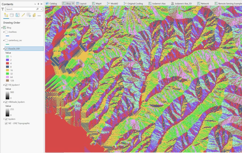
Bit crazy looking – note the values in the Contents. These relate to flow directions relative to the grid cell of interest:

(And here the first inklings as to why our REC riverlines look the way they do…)
Next, we run the Flow Accumulation tool which takes the Flow Direction layer as its input and, for each cell, starts to sum up the number of cells above it that are contributing to that cell, so low flow accumulation values would be near the top of the catchment and values increase as one moves further down. Here’s ours for the Kaituna:
Nothing to write home about (yet) but we’ve now actually got a lot of useful information to start better defining where the rivers run.
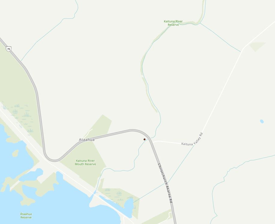
Next step – I have to create a “pour point” – this is just a point that tells the system where the outlet of the catchment is. I’ve placed it manually near the highway bridge that runs over the Kaituna River:
Yet another step along the way (anyone keeping a running tally?) – ran the Snap Pour Point tool which basically just converts my point to a raster and snaps it to the nearest Flow Accumulation grid cell. Nothing to see with this output so we’re on to our next big step – creating a catchment boundary layer.
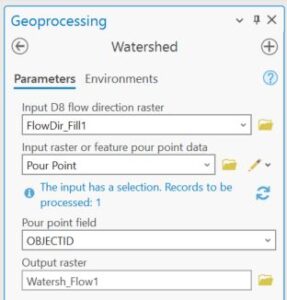
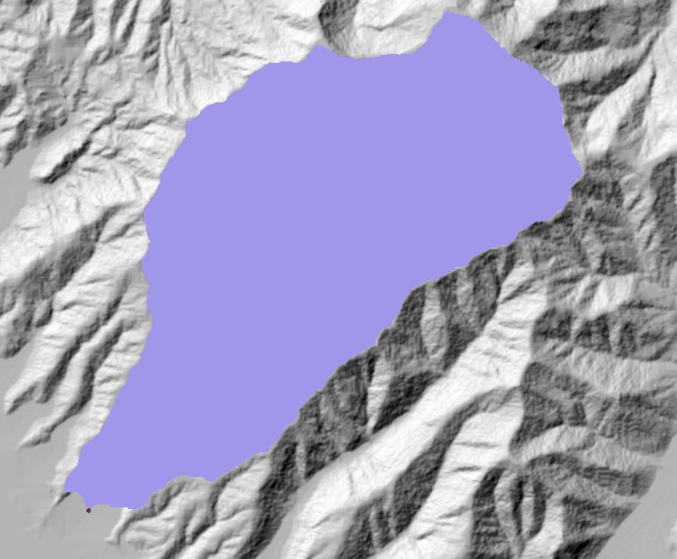
The Watershed tool helps us next define the extent of the catchment:
And here’s my result:
Nice! It’s a raster layer which might be more useful as a vector polygon and the aptly names Raster to Polygon tool quickly does the job (symbolised in blue with a hollow fill):
We’re now poised for the last and most important step along the way – creating the river lines based on all these layers. Hopefully you can see how they all work together to map where the river would flow based on the terrain. We’ll use a seldom used, unsung hero of raster analysis to get the rivers – the Con tool. This is basically a tool that let’s us reset values in a raster layer based on some conditions, such as if elevation value is above 100 m, give that cell a value of 1 in the output, so it’s really a form of reclassification. In this case, we use Con on the Flow Accumulation grid to find cells with accumulated values above some threshold – magically (according to Clarke’s 3rd Law) we get rivers out of this. Here’s how I set the tool up:
The 500 in “Value is greater than or equal to 500” was a bit of trial and error. The lower this number the more stream segments you get. 500 gave me some results similar to the REC dataset, as shown below:
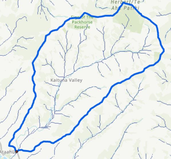
The output here is a raster with a 25 m resolution, so to better compare it to the REC data I’ll convert it to a vector feature class (using the Stream to Feature tool) and set the line widths and colours to they stand out better; REC in green, ours in blue:
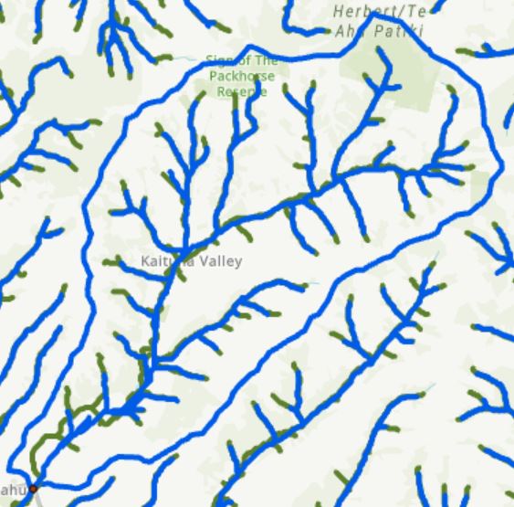
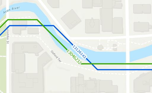
Some reasonably good agreement, though things are quite different near the outlet – which might get down to the differences between the different DEMs used. Let’s zoom in a bit and hopefully see the reason for this whole bloomin’ post in the first place:
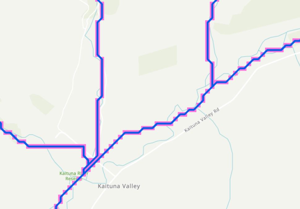
I hope this image makes sense – our resulting vector river line is in blue. The pinkish areas are from the original raster streams layer so the line basically goes through the centre of each of the cells. Notice how the line segments are either east-west, north-south, or at a 45 degree angle – just like we saw at the beginning. And this takes us right back to the raster nature of the original input – the 25 m DEM. This accounts for why the resulting line layer is so stair-steppy and not smooth – water only flows into one of its nearest neighbours in one of our three directional options.
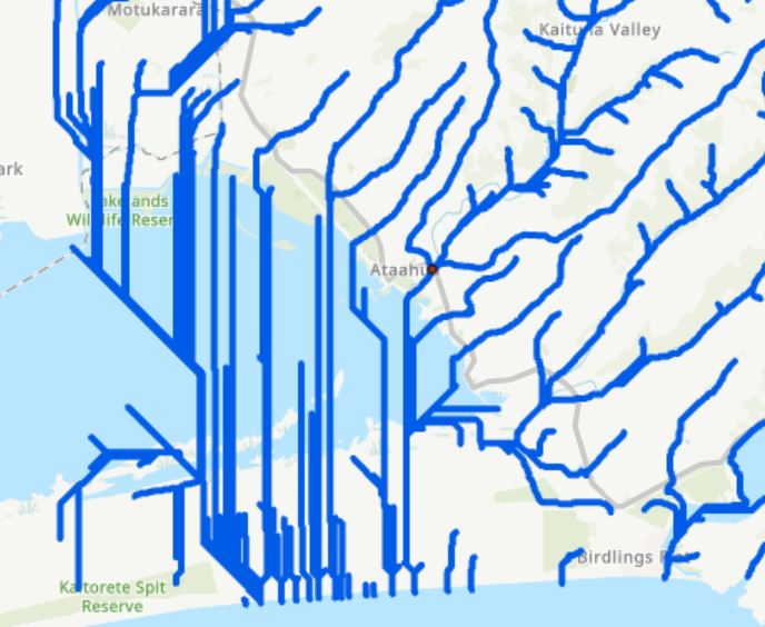
This is a fairly involved process and lots of places where it can go wrong. And it’s not a perfect process, especially in flat areas. Case in point, look at what a mess it makes of things trying to find it’s way through Te Waihora:
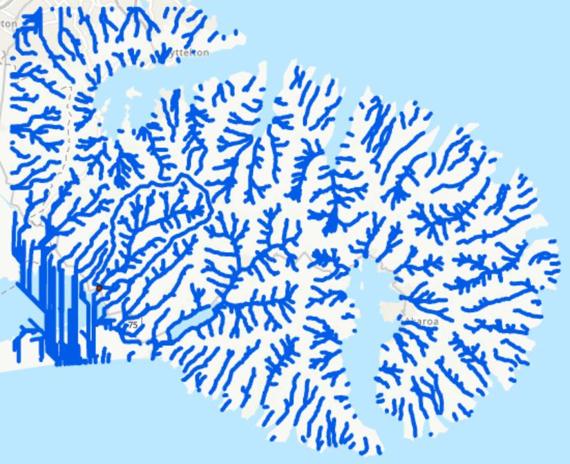
But in hilly areas with enough terrain, this works pretty well. As a double bonus, the DEM I used for this exercise was one covering all of Banks Peninsula, so I’ve actually ended up with simulated streams across the whole peninsula:
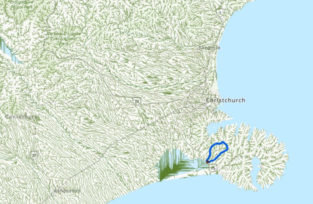
And of course this is quite similar to what our friends at NIWA have done with the REC database, which covers the whole country (here’s just a bit for Canterbury):
I don’t know for sure if these are the tools NIWA would have used but they’re certainly one way to do them within the ArcGIS ecosystem. All of these tools live in the Hydrology toolset and are there for the taking. All you need to get started is a DEM and a fair modicum of patience.
One might be tempted to think that, in these days of LiDAR and all, that the improved resolution available would give you better outputs. I’ve looked in to this a bit and my experience thus far is that LiDAR almost gives us too much information – the resulting stream networks end up doing some crazy things, but that’s a story for another day.
I’m exhausted after all that…
C