Zones of Influence
The role of polygon zones in our lives is up for discussion with a zinger at the end.
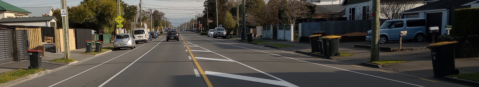
The image above should raise a number of questions. What am I doing in the middle of a busy street? for one. And what does busy Barrington Street have to do with anything? Note a subtle difference in the picture above. It’s clearly collection day but see how on one side of the street the red bins are out and on the other side it’s the yellow bins. I’m sure the red bin people snicker at the lowly yellow bin people across the street every Tuesday, and then reverse it the next week. We’re clearly standing astride a boundary between two collection zones. Is this case it’s refuse collection by the council. And this gets me thinking about zones; zones of influence. And what’s the best way to represent zones? Why, polygons of course. So this post is mainly about polygons. I don’t like to show any favouritism to any particular feature type, but polygons do loom large in our lives. I’ll try and show you what I mean with some examples.
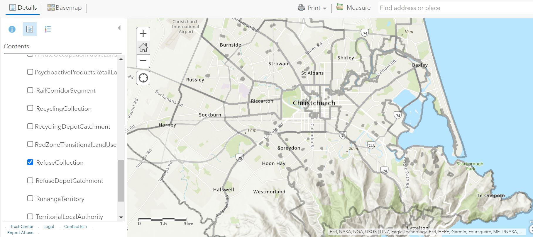
As noted above, there’s a boundary of some sort running right down Barrington Street. In searching for some data to confirm this, the closest I could come was accessing the CCC web services where I found a web layer showing the refuse collection zones:
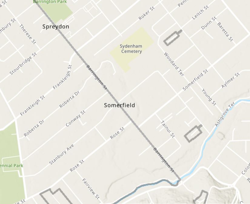
Zooming in to Barrington Street you can clearly see it running down the middle of the street:
This zone affects my behaviour every Monday evening – is it red or yellow this week?
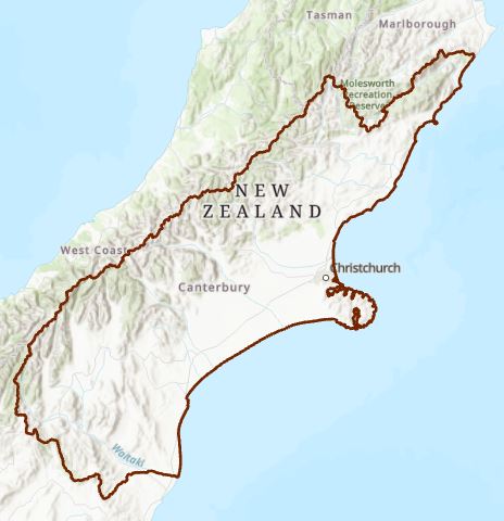
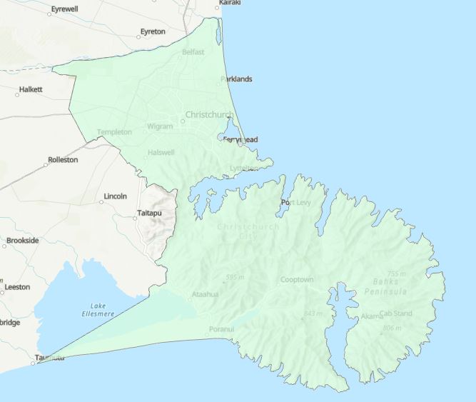
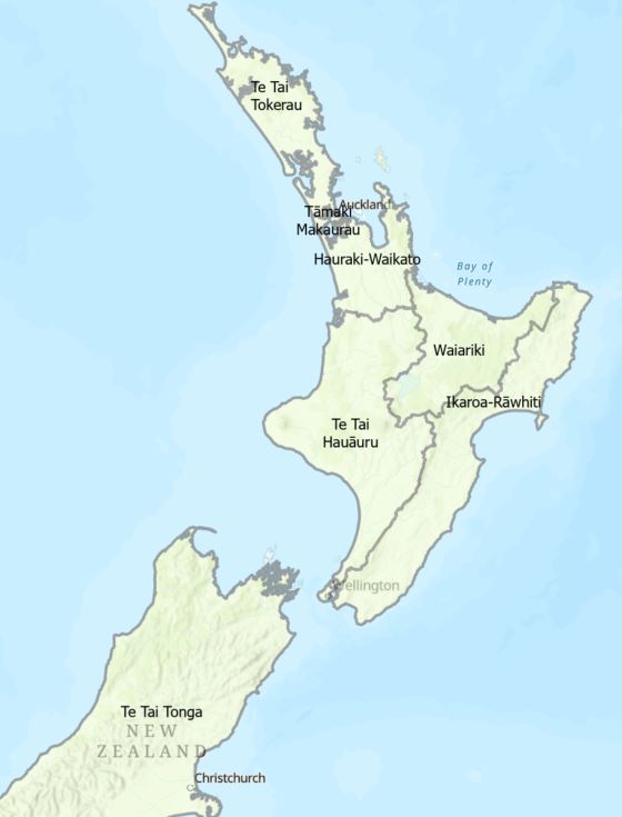
Let’s look at a few other obvious examples. As proud Cantabrians, we are situated within a rather large zone of the region:
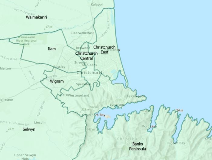
And of course within that, we’ve got our CCC boundary – within which we pay our rates, depending on where were are in that zone (among other things):
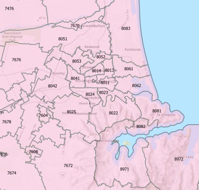
And of course within that zone we’ve got suburbs and neighbourhoods. How about some post codes?
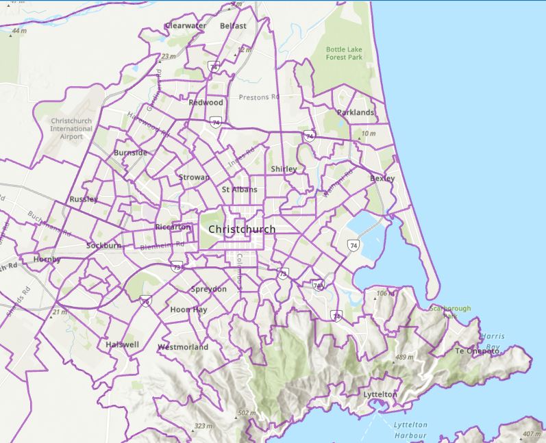
Getting down to this scale we can also think about census zones, which end up having a big impact on how decisions get made locally and nationally. Here’s are the SA2 areas (statistical area 2 – roughly equivalent to suburbs, but don’t quote me on that):
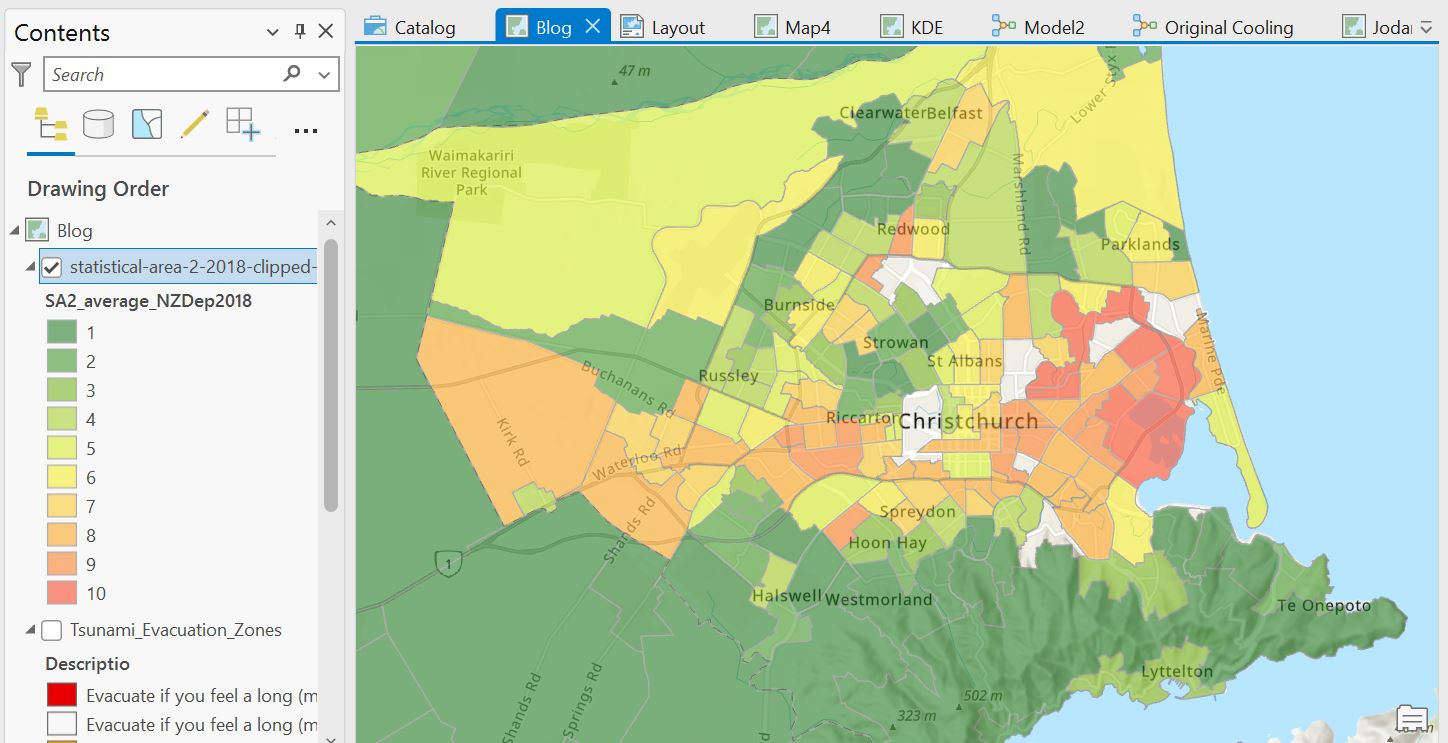
We could go down another level to the SA1 level, but we’ll save that for another day. This then opens the door to some mapping with the New Zealand Deprivation Index, which allows us to look at socioeconomic differences over NZ. The index ranges for 1 (low deprivation) to 10 (high deprivation):
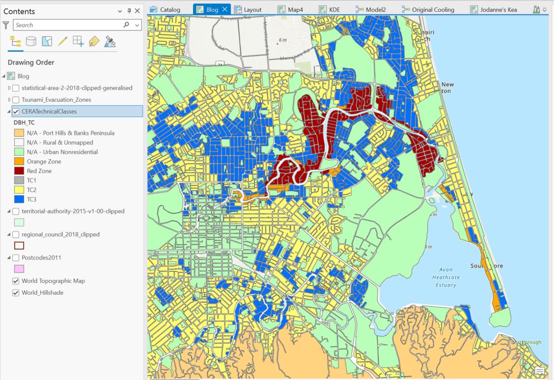
While these particular zones don’t really influence our lives, they do give us some insights into how lives may differ geographically. But other zones have had some rather big influences on many people’s lives over the past decade. TC zones anyone?
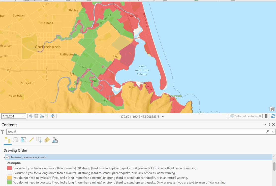
Hope that hasn’t brought back any difficult memories for anyone. Here’s a zone that will probably have an influence at some point, but who can say when? Tsunami evacuation zones from ECan:
But I’d like to bring things around to what is arguably the most influential zone of all, but one where you have the influence. Here are the electoral wards for much of Christchurch:
And the Maori wards as well:
(Copies of these layers available in J:\Data\Administrative_Boundaries and from Stats NZ)
Not to ask too personal a question, but which zone do you live in? Where do you have the most influence? Local government elections are upon us and so far, the turnout seems miserably low. My whole point in this post is to encourage you to get your vote in if you haven’t already. Local government’s not very sexy but it is important, so please either get the bastards out or get the right ones in. Voting is a privilege as well as a right. Dare I say it’s also a duty?
Having said that, I can’t remember a time when it was more difficult to do one’s civic duty, given all the disinformation, or sometimes, wilful lack of information on candidates’ backgrounds and agenda. There’s precious little to discern from the pamphlet that comes with your voting papers. This site gives a bit more detail and I encourage you to do your research.
Get out there and vote for you favourite polygon! You’ll only be sorry if you don’t.
C