Only Connect
We use network analysis to find streamflow gauging stations downstream of phosphorus sampling points
In his novel Howards End, E.M. Forster encouraged us to “only connect”. He was talking about connecting the prose and the passion in our lives, to the exaltation of both, but here we’ll talk about connecting sampling sites within a river network. I’m afraid this post won’t be nearly as eloquent as Forster (Ed. or nearly as entertaining…) but here goes anyway.
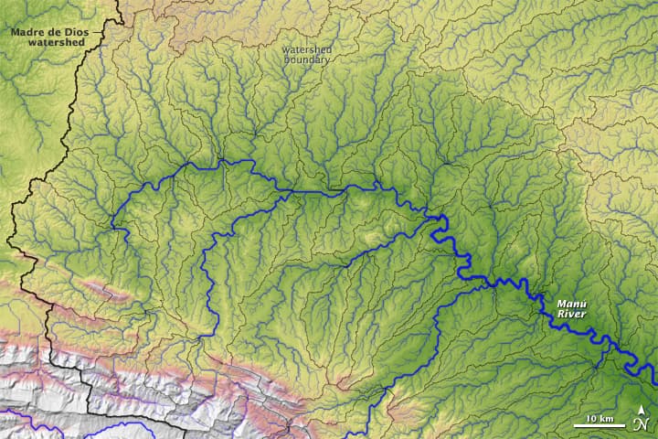
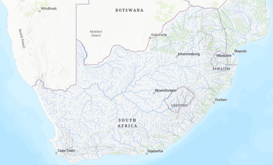
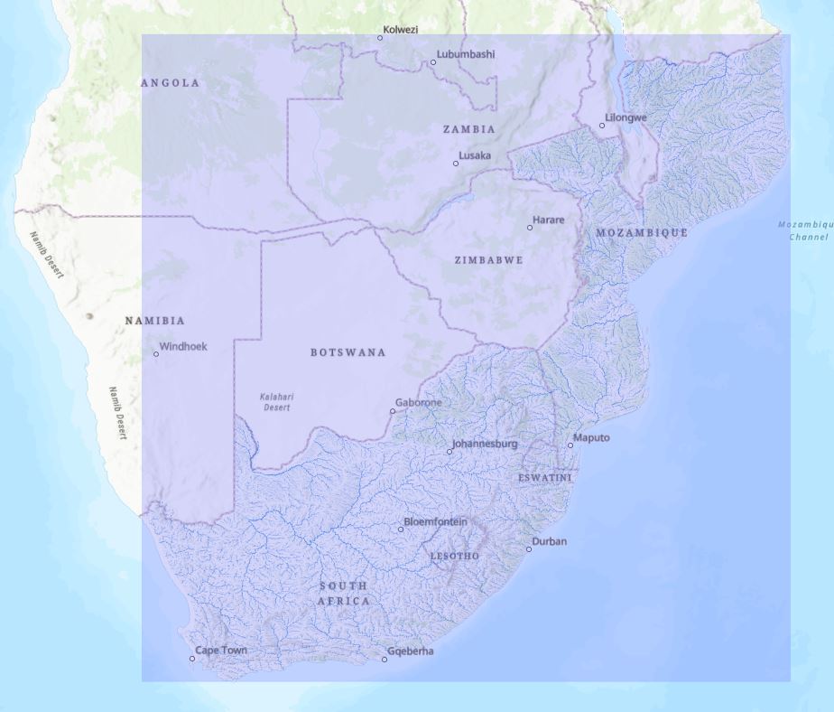
In a previous post we looked at using Near to help identify river flow gauging stations that were close to phosphorus sampling sites. All well and good, but before we can be confident about linking these we need to know for sure that the sites are sampling the same conditions. This brings in whole a new thing to consider – the rivers. Recall that what we’d like to end up with is a simple table that links each Phosphorus Site to the nearest Flow Site downstream. For this post we’ll continue looking at South Africa as a test bed before we go global. The layer we’ll use is HydroRIVERS, a global scale layer of rivers and streams, clipped to our previous extent:
One nice thing about this layer is it includes an attribute for Strahler river order. Headwater streams are 1st order streams. As the rivers gets larger (and as more tributaries contribute flow) the order increases. This allows us to symbolise the data in a way that highlights the relative size and connectivity of the river reaches. Zooming in, we can see this better:
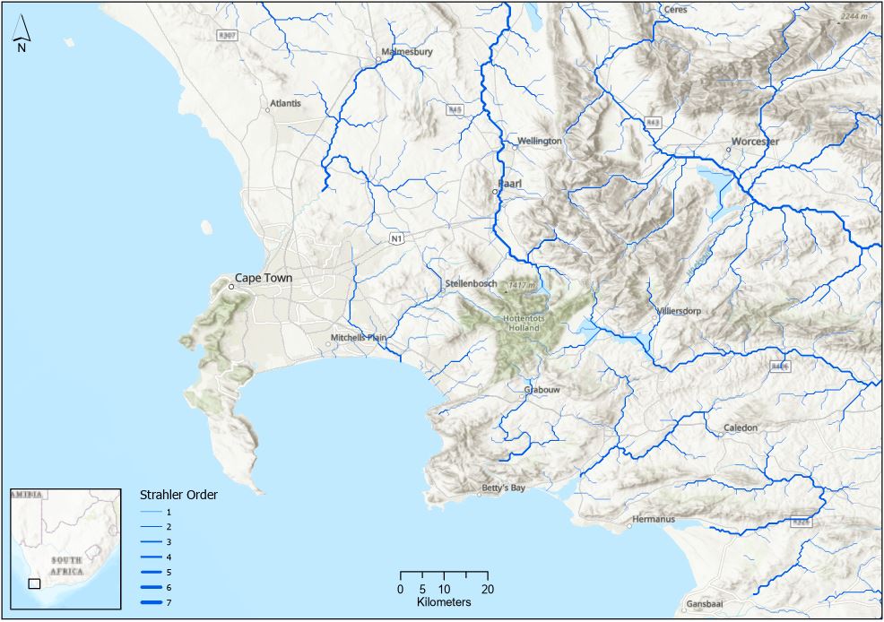
I used Graduated Symbols here to emphasise their relative size. (Sidenote – there look to be some issues with this layer close to the coast – some just sort of disappear. The rivers were derived from a global elevation layer that likely didn’t have the full extent of coastal areas.)
So, we’ve got our Phosphorus and Flow Sites layers from before and now we have a layer of rivers. In its raw form this layer is just a bunch of (useful) lines on the map – it doesn’t “know” anything about what’s upstream or downstream, it just knows where the riverlines are. To allow us to follow river reaches downstream we’ve got to add in some new capabilities, specifically making the connectivity between features explicit. This takes us into the realm of network analysis. Networks can be any set of connected linear features (roads, fibre optic networks, sewer systems, airline routes or, in our case, rivers) that some resource (people, information, waste, airplanes, or water) flows through.
There are two kinds of network data structures available: network datasets and trace networks. Trace networks are lighter versions of network datasets, the latter of which can do more advanced kinds of analysis. If you’ve used Google Maps to get directions, you’ve already done some network analysis (Ed. Congratulations!) that our Google overlords maintain. In this post we’ll look at network datasets and I’ll save the trace networks for another post (Ed. Gee, thanks…you’re just tooooo kind…)
HydroRIVERS is a great dataset to work with for this because they’ve done some nice preprocessing to make the whole effort easier, including digitising the lines from upstream to downstream. Sounds like a small thing but it’s absolutely major. If they hadn’t I wouldn’t even consider doing some of this. The version I’m working with is called Riv_Project (These data were projected from WGS84 to WGS 1984 Web Mercator (a projected coordinate system) so we can work with length in meters rather than decimal degrees).
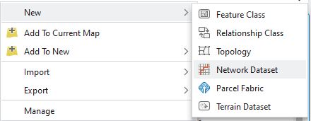
Before we get too deeply into things we need to be aware of a data structure knows as feature datasets. These simply allow us to group our data together within a geodatabase. You could think of them as subfolders within a folder. Importantly, we can only create network datasets (or trace networks) inside a feature dataset. All the layers within a feature dataset must be vector and use the same coordinate system. To create a new feature dataset, right-click on the a geodatabase in the Catalog pane or Catalog View and go to New > Feature Dataset.
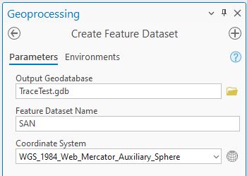
I’ve called this new feature dataset SAN and set the Coordinate System to match my data. To get the rivers layer into the feature dataset I can just copy and paste – it ended up being called Riv_Project_3.
Then, by right-clicking on the feature dataset, a new Network Dataset can be created under New:
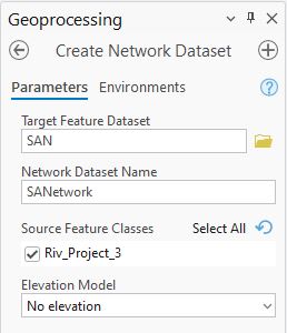
The tool is pretty simple – give the new dataset a name, tell it which line feature to use and pick an elevation model (sometimes our networks need to be 3D, think of bridges over roads – having an elevation means we can route things over the bridge and they can’t follow the road underneath, and vice-versa). I’ll use No elevation here:
When run this adds a new layer to the map farmed by a purple rectangle:
This just means the connectivity issues haven’t been resolved yet. Most will usually get fixed when I right-click on SANetwork in Contents and pick Build. This establishes the connectivity across lines and junctions which tidies up all the problems and we’re almost ready for some analysis.
At this point we’ve got a network where we can find routes, or pathways, along the rivers, as well as do things like find area within a given distance around a point, along the network (known as Service Areas).
We’ve got a special case network here which needs to only work in one direction: downstream. This got a bit messy so I won’t go into all the gory details (but you can look in the Add Restrictions and Descriptor section here to get a sense of it. I’m interested in finding the nearest flow station to each Phosphorus site downstream along the network.
When the network name is right-clicked we get an option to select a New Network Analysis Layer with several options:
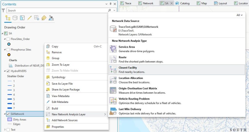
Subscripts in that image give you a sense of what each type can do – Closest Facility should work well here.
When selected, a new layer gets added to the map:
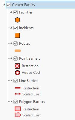
We need to tell it which are my “Incidents” (starting points) and which are my “Facilities” (ending points). With this layer on the map we also get a new ribbon, entitled Closest Facility Layer:

By clicking on either Import Incidents or Import Facilities buttons, we can point it towards the right layers for Phosphorus Sites (n = 61) and Flow Sites (n = 523) respectively – these appear on the map as squares and circles:
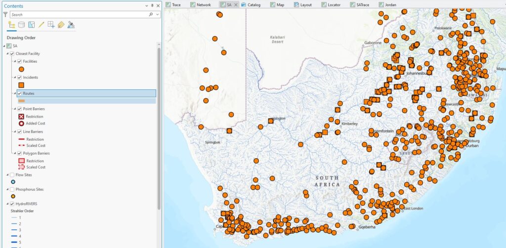
All I need to do next is click Run and I get some new lines on the map (squares are Phosphorus Sites, circles are Flow Sites):
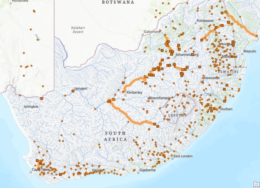
We’ll zoom in closer:
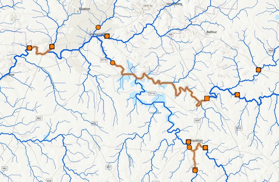
The tool has found its way downstream from the Phosphorus Sites to the Flow Sites along the network – nice. Looking at the attribute table, we’ve got some additional bonuses:
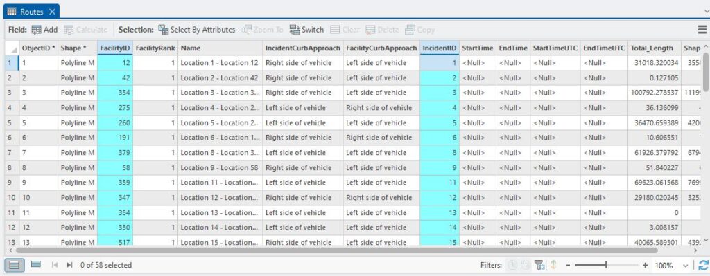
The FacilityIDs can be related back to the Flow Sites and the IncidentIDs to the Phosphorus Sites, which was what I was after from the start. The IDs in this table relate to the OBJECTIDs in my respective input layers so with two table joins I can bring those in, turn off the attributes I’m not interested in and export this table to a CSV or Excel spreadsheet for further analysis by Jordan, et voila!
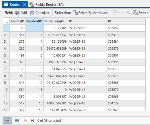
The first column of IDs with entries starting with “WQ” are the Phosphorus Sites IDs and the numbered IDs in the last column are the Flow Site IDs. One thing I didn’t mention above is that we also get a distance downstream to the flow sites (the Total_Length attribute, in metres), so if need be we can filter the ones that are too far downstream (we actually went an extra step and looked at matching stream orders but I won’t torment you any further than I already have). Some of them are over 20 km downstream so can easily be eliminated.
As a postscript we found that many of the Flow Sites were just upstream of the Phosphorus Sites and so weren’t found. That meant trying two other strategies: first use Near to match those within a given distance and then do the downstream tracing with the remainders or turn off the downstream direction restriction so it could also search upstream. Both worked but using Near first made for a bit less work (and confusion) so that set the workflow. Next step: we go global.
Doing network analysis on roads is pretty commonplace, an everyday occurrence really, but this is a nifty example of using Network Analysis on a river network where we’re constrained by flow in only one direction. We’re not really modelling flow, per se, but we are modelling the direction of flow within the network. It’s also another good example of some hefty analysis and all I’ve got to show for it is a dinky little CSV table.
We did test out trace networks for this quite extensively, but found them to be lacking in a few key aspects which I may (or may not) cover in a future post.
C