Never Underestimate a Nematode
We look at how some simple data exploration can help us better understand spatial problems.
Postgrad Ella has a thing for nematodes, but who am I to judge? As someone once said to me, with a bit of a sigh, “People will research anything…” Actually, nematodes are quite important to understand, especially if you’re a kumara grower. Some nematodes are parasites that lead to reduced production. They don’t get much press, so Ella wanted to shed some light on these creatures.
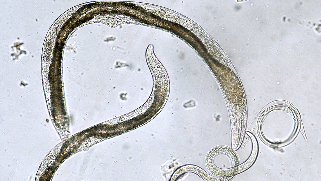
Nematodes (as I have come to learn) are microscopic worm-like animals, mostly found in soils and numbering up to 30,000 known species. Some play a beneficial role in organic matter decomposition, while others are parasitic and detrimental to crops.
Those affecting kumara are of interest to Ella, so as a diligent postgrad, she has been out sampling nematode populations in various kumara paddocks, hoping to better understand their impact on yields. She looked at a number of paddocks in Northland, where conditions are good for kumara (soils, temperatures, rainfall, among other factors) and was able to count the number of nematodes at different locations within each paddock. For the record, she collected and average of 159 samples at 20 different paddocks. Amongst the data in her summary spreadsheet are latitudes and longitudes – the very stuff that makes mapping the samples possible. Here’s a sample from her spreadsheet showing the key data for our purposes: latitude, longitude and total abundance and a total of 171 records:

As we seen many times here on the blog, we can add spreadsheet data directly to a map as a stand-alone table (it’s called Sheet2):

Once is been added, a right-click on the table name > Create Points from Table > XY Table to Point will allow us to map each record:

The tool can usually figure out which are the X and Y coordinates but you may need to set them yourself. Given these are Lat/Long, we need to set the Coordinate System to WGS84 and give the output layer a meaningful name:

Et voila! Points on the map:

Now what? Let’s zoom into some of these points and see what they can tell us. We’ll zoom in to the area near Dargaville on both sides of the Wairoa River:

This is helpful but a bit lacklustre – all the points are of the same size and colour so they don’t really tell us much. But recall we’ve got an attribute called TotalAbundance, which represents the number of nematodes counted at each site. How much variation is there across sites? We can quickly get a feel for this by right-clicking on the attribute in the table and picking Explore Statistics:

This gives us some key descriptive statistics:

So, clearly some variation – let’s try and visualise this a bit better. We could use something like Graduated Colours to show the variation – maybe something like this:

(I’ve just used default values here – nothing fancy.) Not bad – the colours definitely get us thinking about the changes – let’s try something else, Graduated Symbols:

Here we’re using the size of the symbol to show how abundance varies; the larger the symbol, the higher the abundance. This is actually a very effective way to show how things are changing and a bit of an Aha! moment for us. If things are this different, why? What’s driving this? Adding more data could help – let start with soils. Here’s the Fundamental Soil Layer for the North Island (NIFSL), colour-coded by soil type:

Hmmm – they all look to be pretty much on the same soil type, so that’s not telling us much. Let’s look at the satellite image:

This may be telling us more – seeing how they vary from paddock to paddock might suggest to us that management may be part of the explanation. Zooming in a bit more, to the southwest, we can see tow adjacent paddocks with very different nematode abundances, prompting some further why questions.

This was about as far as we got, as we both concluded that it might be time to gather some information on management practices. Climate variation could be part of this, but over such a small area, there’s unlikely to be much variation (plus, all our climate data are at 500 m resolutions so we wouldn’t see much variation at this scale anyway.
This post has mainly been about how exploring your spatial data can be a good first step – by simply visualising things (as we’ve seen with Dr Snow and the Soho Cholera Outbreak) can really deepen our understanding of a problem.
There’s more work for Ella to do in understanding the impact of nematodes on kumara production (both with GIS and in the lab) but this is a good start and an interesting part of the story.
One of the joys (Ed. really?) of doing GIS is that I get to learn about things that I would otherwise never know about – and nematodes are in that category. Here we’ve looked at how some very simple data exploration can 1) generate new questions, and 2) get us thinking about why things are the way they are. Think about that the next time you bite into a tasty kumara chip.
C
