Nearer my Points to Thee
We use the Near tool to link streamflow gauging stations close to phosphorus sampling points.
In a previous post we looked mapping some water quality sampling points using the visual hierarchy. We’ll continue looking at a few aspects of this project over the next few posts and hopefully see some interesting and fun stuff along the way. And don’t worry; despite the title of this post, I won’t be getting all religious on you, though some people do like to do that with GIS.
With Jordan’s research, he looking at concentrations of nutrients (nitrogen and phosphorus, in particular) but also at contaminant loads in rivers. Concentrations are measures of mass per unit volume, typical as mg/L, while loads are the mass (or volume) of contaminants over time (e.g. kg/day). To convert concentrations to loads you need to know the flow rate (m3/sec) – a simple example of this conversion is:
Load (kg/day) = concentration (mg/L) x flow rate (m3/s) x 86.4
(Ed. are we still awake?) As we saw previously, Jordan has a global set of phosphorus concentration sampling points. He’s also got a global set of flow gauging sites so if we can match them up then he’ll be able to calculate loads. This would be easier if we had a table that links each phosphorus sampling point to its closest flow site.
Like many things in GIS that sounds easy but gets complicated when you get down to doing it. We’ve found we needed to have a multi-pronged approach to do this properly, mainly because points need to be close to each other but also need to be on the same river. In this post we’re going to look at a first cut, or more of a screening approach, to find the phosphorus and flow sites that are close enough to each other to be considered to be representative of the same location. Later we’ll worry about whether they’re on the same river or not. To test out our workflows, we’ve been working with data from South Africa – 61 phosphorus sites (in orange) and 523 flow sites (in blue):
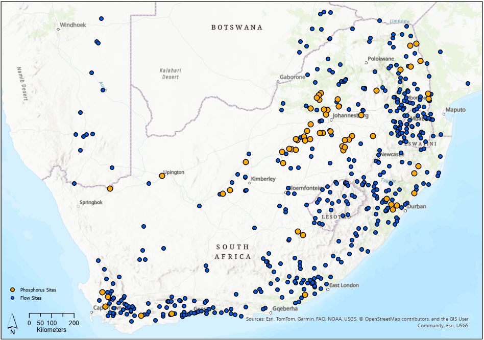
Easy to see from the map that there are many more flow than phosphorus sites and that some phosphorus sites are close to flow sites, but how close? And how close (or rather, far) is too far?
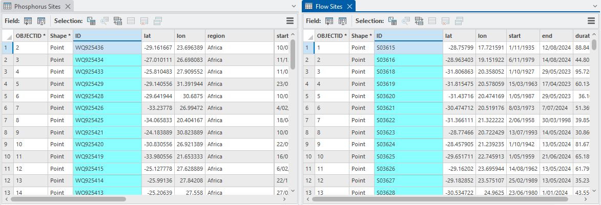
Each layer as an ID attribute that gives us a unique identifier:
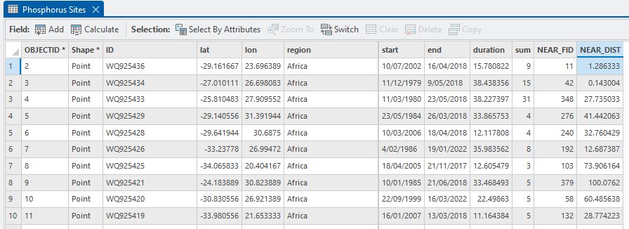
As a first cut it would be nice to know how far apart these points sets are. The Near tool comes in handy for just this purpose and calculates the straight line distance between features. In the process, it adds new fields to the input layer: NEAR_FID and NEAR_DIST. (Here we’re doing point-to-point distances but this works with any combination of vector features – points, lines and polygons.) If we set it up so that the Input Features is the Phosphorus Sites layer and the Near Features is the Flow Sites layer, the distance from each phosphorus point to the nearest flow site will be calculated and added as NEAR_DIST (Ed. There’s some terrible grammar in that sentence…). The key thing is that the NEAR_FID is the OBJECTID of that nearest flow site – this becomes important later. Here’s the tool set up:
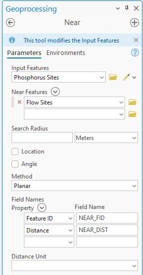
Note that I could add a Search Radius that would limit how far out the tool searches. Anything beyond that distance would get a value of -1 for the NEAR_FID and NEAR_DIST. For this example we won’t limit things. When run, we get an updated Phosphorus Sites attribute table:
Great – digging a bit deeper into this, here’s a histogram of the NEAR_DIST values (right-clicked on NEAR_DIST > Visualize Statistics):
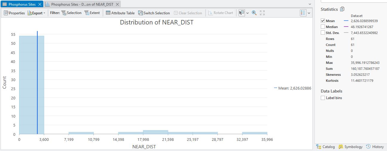
The vast majority of the points (54 of them) are within 3,600 m of a flow site and you can see some descriptive stats to the right. The minimum distance is 0 which means they are in exactly the same place. Max distance goes out to 35,996 m so at some point we’ll probably want to disregard some of these flow sites – they could easily be on different rivers. We’ve got some decisions to make around how close is close enough but for now, let’s go one step further – linking the flow site IDs to each phosphorus sites.
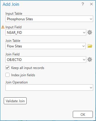
The NEAR_FID allows us to do this with a table join. To set up a table join, right-click on the Phosphorus Sites layer name in the Contents and go to Joins and Relates > Add Join. Remember that the NEAR_FID in Phosphorus Sites relates to the OBJECTID in Flow Sites:
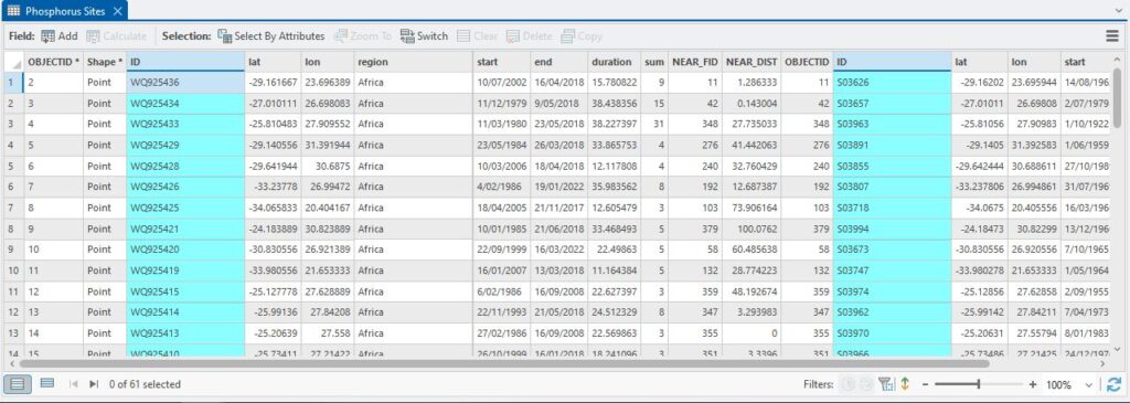
When OK is clicked, the tables are joined, linking the two layers and the IDs of both are now available:
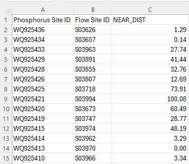
We noted earlier that it would be nice to have a table with the linked IDs, so one way to do that is it export this attribute table as either an Excel Spreadsheet or, say a CSV file, which could be used in R or Excel or whatever your favourite spreadsheet software is. If it’s Excel, the Table to Excel tool does the job. If it’s CSV, click the three horizontal bars at upper left (Ed. you mean the hamburger menu?) and go to Export.
When exporting to a CSV (or DBF or TXT) the key thing is to save the output to a folder rather than a geodatabase and add the right extension:
Once exported, I can delete any unwanted columns and here’s something I can work with further:
Tied to each site is time series data for each parameter. Jordan’s got some more work to do with R or Python to do the load calculations but he can’t really get started on that til we’ve done the spatial thing.
At the end here we’ve gotten to a point where we’ve linked each Phosphorus Site to its nearest Flow Site. As we saw earlier, our distances range from 0 to 35+ km. As this distance increases, we should feel less confident that the sites are on the same river. And how are we going to be certain that the sites are on the same river? A very good question that we’ll address next time.
C
Sidenote: the astute amongst you may be thinking I could use a spatial join to link the sites (from Joins and Relates > Add Spatial Join). This is absolutely correct, though what I’d be missing out on is knowing how far apart those sites are.