Location, Location, Location
Adding spreadsheet data to a map and displaying house price index data
They say that the three most important things in real estate are location, location, location. I always trot that one out at the beginning of a semester and extend it to most everything we do at Lincoln, but in this post we’ll look at this in its natural habitat – house prices.
CoreLogic released their monthly House Price Index report on Thursday so I took this as an opportunity to see how easy it would be to grab their data and map it.
A quick Google search on “zealand house price index” took me to a download page for the report. Much to my surprise, what I eventually got was not a PDF report but an Excel spreadsheet, almost ready for mapping – huzzah!
Two sheets in this spreadsheet, one that breaks down the average current value of house prices, 12 month change (%) and 3 month change (%) by territorial local authority (TLA) up to February 2024:

And the second sheet strips away some of the nice formatting and leaves us just the facts, ma’am:

According to CoreLogic, “(b)y calculating the average property value in each area, comparisons can be made with previous periods.” My aim here is to be able to map these data to add the visual dimension and hopefully help us understand the data better. I’m a big fan of data but tables of numbers only get me so far.
To map these values, I’m going to need some spatial data to attach them to. Since the CoreLogic data are based on the TLAs, I’m planning on using the most recent layer I can get my hands on – found here on the StatsNZ data portal (and there’s a copy in J:\Data\Administrative_Boundaries). Here it is on the map with the table open:

One thing that I can already see will need some attention is that the TLA names in this layer all have “District” or “City” at the end while the CoreLogic entries don’t – I’ll need to have a one-to-one match later for things to work.
I’m happier with this second Excel sheet as there’s less I need to do to it to get it ready for mapping as it’s got less formatting. The key thing when adding spreadsheets to Pro is that the first line is attribute names with no fancy-schmansy characters or spaces, no numbers to start an attribute name, and all data are arranged in columns, with a single line for each record. I still need to do a bit of work, specifically
- Give each column an attribute name
- Remove the region names (e.g. “CANTERBURY**”)
- Make sure the territorial names match what I’ve got in my spatial data layer
On closer inspection, I had a bit more work to do to get this ready. The main issue is that CoreLogic breaks some areas down finer than the TLA layer does. As an example, the Christchurch TLA shows the full extent of the city council area:

But CoreLogic breaks their data down into several smaller areas for the larger urban centres, e.g.:

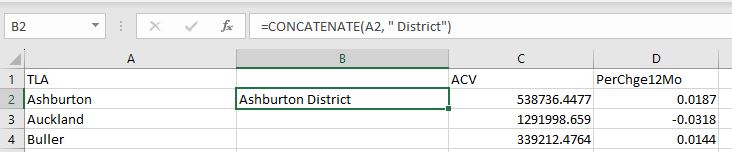
I’ll need to think carefully at how to handle these. My best option would appear to be using, in this case, the Christchurch values of $758,452/1.6% for the whole of the CCC area (and others). That’s a painful extra step I wasn’t counting on. Since I’ll need one-to-one matches between the spreadsheet and the spatial layer, I had to add “District” or “City” onto each TLA value (“Auckland” has neither, they think they’re sooooo special).
So here’s my rejigged sheet:

To get the “District” added I used Concatenate in Excel:
With that all looking good, we’re back into Pro. I can now add this sheet (called “Rejigged Data”) directly to the map with Add Data – it appears at the bottom of the Contents as a standalone table, which I can open in Pro to double-check:

Now the power move of linking the table to the spatial data. We’re back once again in the realm of table joins, a really useful technique for mapping spreadsheet data. These work so long as there is a common key attribute between the two files that allows me to link them. In this case its the TLAName attribute in Rejigged Data and TA2023_V_1 in the spatial layer. The attribute names don’t need to be the same but the cell values need to be exact matches – hence all that work in adding “District” and changing some to match (Hawke’s Bay has an apostrophe in the layer but not in the spreadsheet, for another example). To join them, right-click on the layer you want to join the table to and choose Joins and Relates > Add Join:

In the ensuing window, link the two together with the common attributes:

When this gets run, the columns from the table get joined to the spatial records:

Now I can use these values for analysis and mapping. As a last step before that, this table join is temporary so to make it permanent, I’ll export this as a new layer (right-click layer name in Contents > Data > Export Features).
So, all this has been getting us to a place where we can better understand these data spatially. We’re now onto how best to symbolise these data. I’ll focus on the % change in house prices for each TLA for this.
I know from looking at the data that I’ve got positive and negative values to work with. I can also see that the values in my table are formatted as the calculated values (e.g. -0.013) rather than as percentages (e.g. -1.3%)
By default, my layer is displayed as Single Symbol, meaning every feature looks the same. I know I’ve got variation from the table, so which method would be best to use here?

Unique Values probably isn’t a great choice – too much work for my reader to differentiate between all the slightly different colours. It’s often good to take data like these and regroup them into a smaller number of classes. Graduated Colors is not a bad option so let’s try that with the field set to PerChge12Mo:

Hmmm…not thrilled by that, especially with those raw values. I’d like to change that to displaying percentages, so I could add a new field and multiply by 100, but instead, I’ll do it “in map” by using the wee Function button next to the Field window. When clicked, I can write an expression to be used:

Now it’s displaying %s:

Given that I’ve got positive and negative values, I’d like to use different colours for each end. It can be a bit tricky but here’s my first draft:

I’ve chosen a red ramp for negative values and a green ramp for positive. There is some debate in the geography community about the use of red-orange-green colours on maps, but I’m a bit of a fan. But I’m second guessing that here because whether you consider a rise/drop a good thing or not depends on which side of the game you’re on. If you selling houses, a drop is a bad thing (red) but if you’re buying, it could be a good thing. So perhaps I should try something a bit more neutral:

This is telling the same story but, to me, in a far less effective way – I find I have to work harder to assign the right response to the right colours. I think I would need to do a lot more tweaking to get this to something I was happy with. But it pays to think about this carefully.
Other options might be using Proportional or Graduated Symbols, but these don’t work very well where there are negative values. A last thing I might think about adding is a histogram so my map reader has a better sense of the spread of the data. This can be done by selecting the layer in the Contents pane (just click on it) then going to the Data ribbon and looking for Histogram under Create Chart:


I’ll be honest – I don’t love these histograms for displaying on maps, but we do get some nice descriptive stats. I can export this and add to a layout, but I’d rather do something else (worst case would be to do it in Excel and then add as an image to the map layout).
Back in the Symbology pane, at the bottom I’ve got a Histogram option:

This is a much nicer one that links to the colours on the map. So I’ll just grab that with the snipping tool and add to a somewhat finished product:

I’m not 100% happy with this as a final product but we’re a long way towards getting there. They key question here is does this map make it any easier to understand the data? I’d like to think so – house buyers looking for a bargain may be better off looking in the North Island while those in the South thinking of selling might be more convinced that the time is right, especially in the Grey and Kaikoura Districts. But don’t take my word for that!
C