A View from the Tops
A weekend walk gets us thinking about the tramping season.
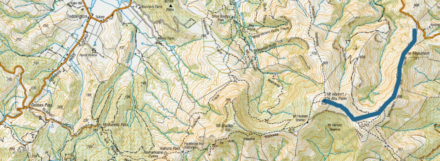
A walk up The Monument Track to Te Ahu Pātiki (Mt Herbert) over the weekend got me thinking about the up and coming tramping season. The family has the Heaphy Track planned for September so this was a bit of a warm up.
One of the more satisfying parts of the walk was getting up high enough that suddenly the view expanded immensely – off in the distance were the foothills of the Southern Alps, white capped from some recent snow, and there was Port Levy and Whakaraupo, not to mention Te Waihora, spread widely as its name implies, and the Tasman Sea beyond. 360⁰ views. The curve of the coast to the north and south made it feel like were getting an outer space perspective with our feet still on the ground. Plus it was neat to be looking down on the transmission tower at Sugarloaf rather than up at it. You get a real sense of the old volcano from up here.
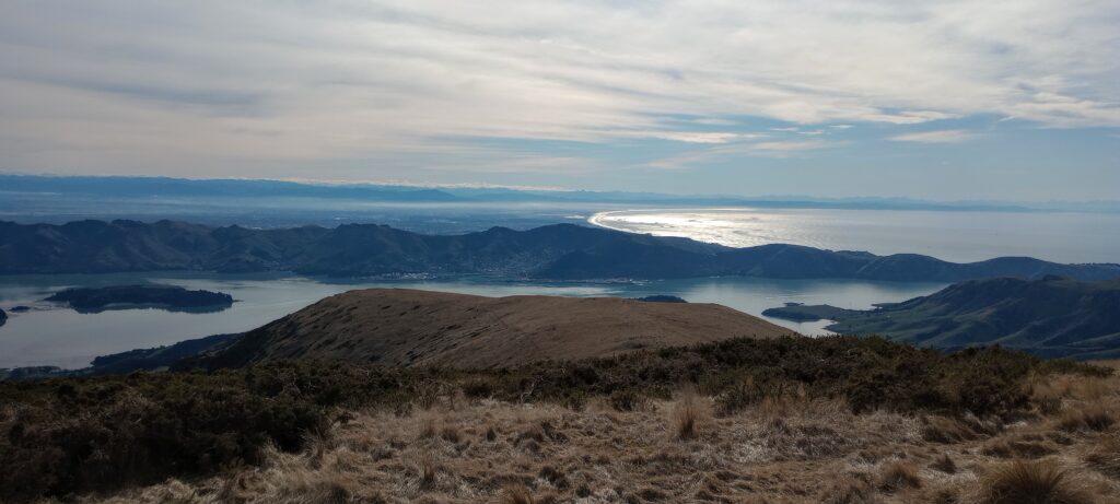
And this, of course is all due to elevation. Te Ahu Pātiki is the highest point on Banks Peninsula at 919 m and so gives us this privileged perspective.
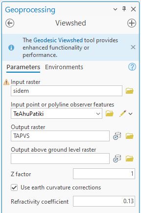
To get a measure of that perspective, how about a viewshed? Using a point at the summit of Mt Herbert and the 25 m South Island DEM, here’s how I set up the tool:
And here’s our output on a hillshade layer, visible areas in red:
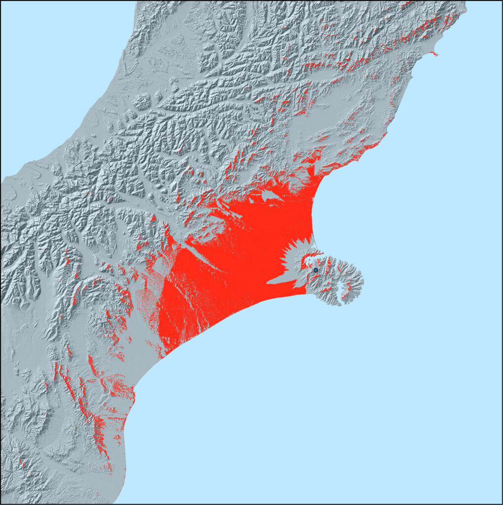
That’s a pretty extensive view. (There’s a Who song that comes to mind…now what was that?)
Pretty standard analysis, though it’s important to tick the “Use earth curvature corrections” for areas this large. We’ve seen this once before but here’s what happens if we don’t:
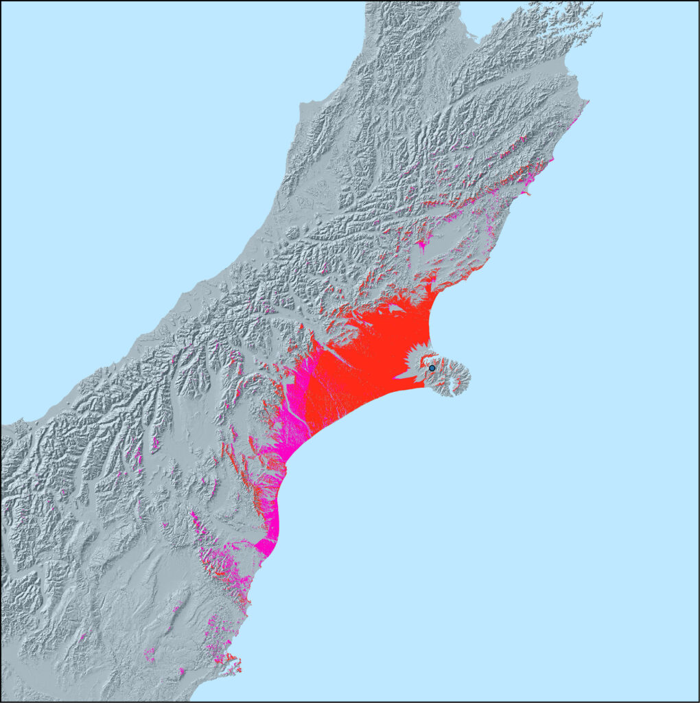
(Additional areas due to not taking curvature into account are in purple. In terms of area, this one is almost 1.5x larger than the one including curvature. And I believe it takes in Mt Cook.)
Another aspect of the walk was that I certainly don’t feel in shape for a multi-day tramp, so gotta do something about that. One option is to park the car far away from the office so I get in some extra walking just as part of the work day. Perhaps it would be helpful to know where the cutoffs are for distances of, say, 1, 2, 3, 4 and 5 kilometres from the office? Buffers would seem to be the obvious way to do this, but buffers don’t take into account that we have to move along the road/footpath network in real life. Instead, we can do a bit of Network Analysis to get those distances along the roads. A quick and easy way to do this is with ArcGIS Online but we can also do it in Pro. I’ll step you through it in AGOL.
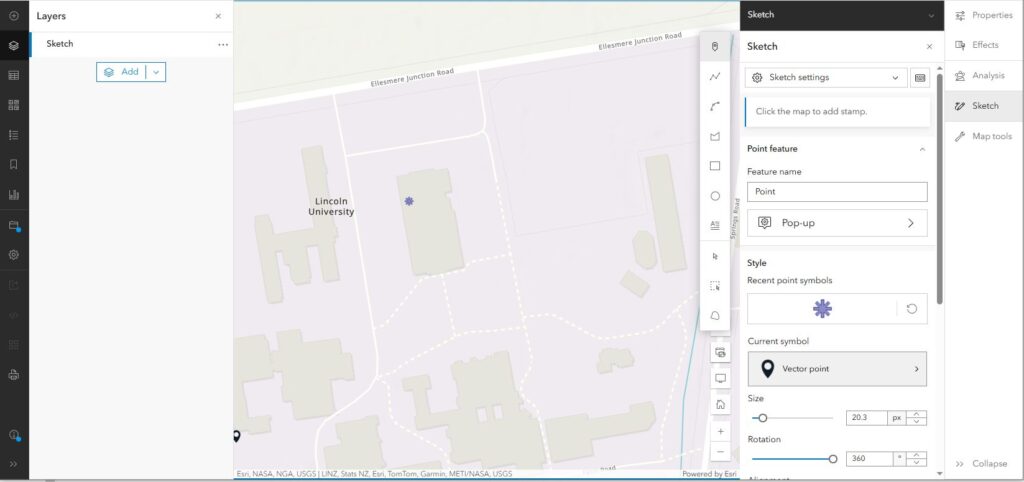
We start out by adding a point as a Sketch. Got to this from the + sign in the top-left menu and placing a point roughly where my office is:
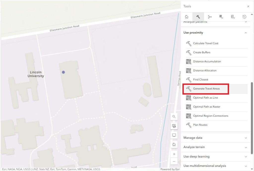
Next, we’ll create a Travel Area (called a Service Area in Pro) from the point. This is an option under Analysis > Use Proximity:
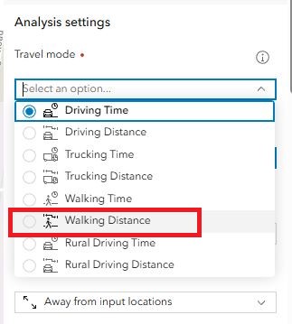
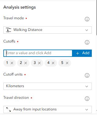
Under Travel mode we’ve got several options related to times or distances for different modes. I’m on foot, so Walking Distance is the choice here:
Setting the cutoffs at 1, 2, 3, 4 and 5 kilometres sets the extent of the zones:
Clicking run generates the different zones:
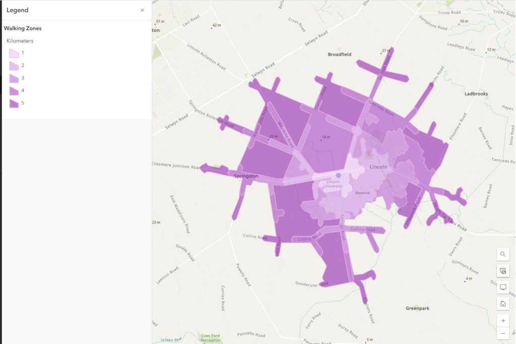
So, now I have no one else to blame except myself if I don’t start parking the car a bit further away. Some of these areas might not be very nice to walk along unless there’s a footpath. I’m not sure that I’ll be parking in Springston but stay tuned.
C
