Points with Purpose
We look at different strategies of mapping global points using definition queries and the visual hierarchy.
Postgrad Jordan had an interesting and relatively common mapping challenge so in this post we’ll look at some of the options we tried to get a final and effective map for his research. He’s looking at the effect of weather whiplash on contaminant loads, specifically, total nitrogen (TN) and total phosphorus (TP). We’ll focus on TP in this post, knowing that we can apply a similar strategy to the TN points. Jordon sent me his shapefiles so I could have a go.
Let’s start with a quick look at the data – a point layer of TN sampling points (collated from 12 separate databases) at a global scale in the WGS 1984 coordinate system. Here’s a quick look at all 48,529 points:
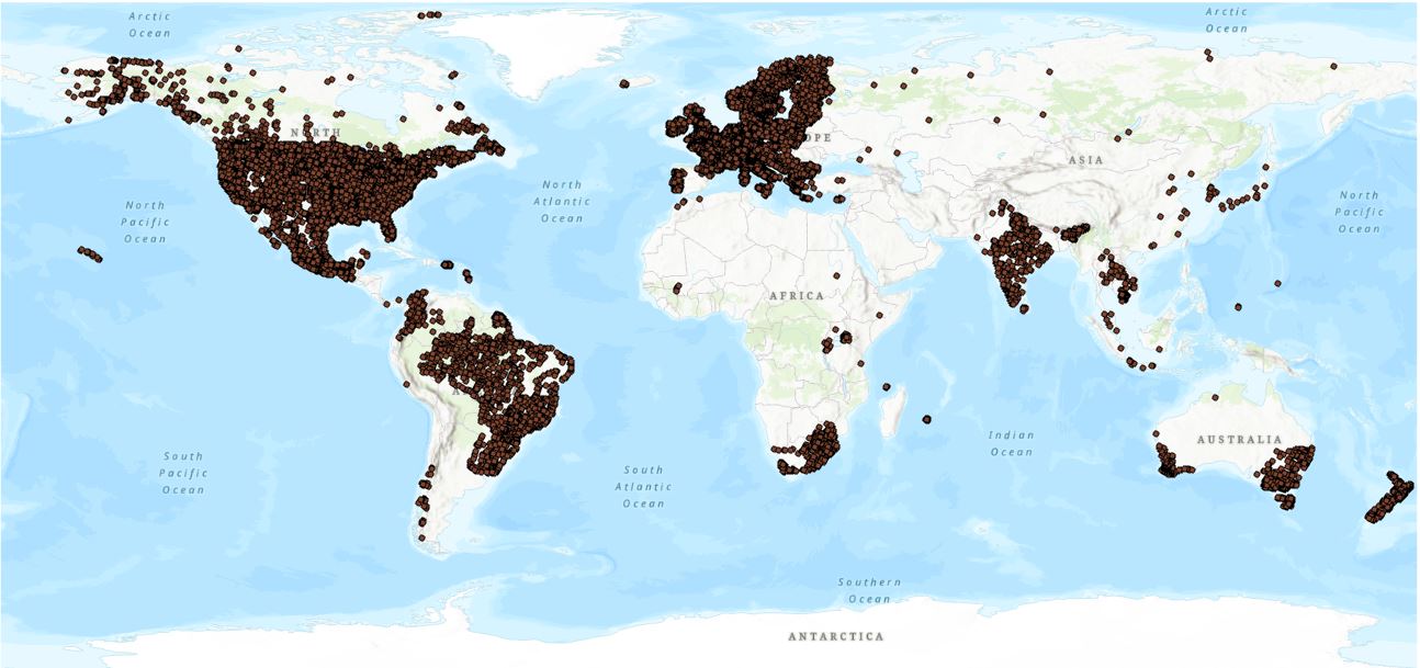
Just looking at the map we can tell we don’t have an even coverage with lots of areas missing – but that’s just how it goes. We can only work with the data that are available.
Every map has a purpose, and this one was to show three levels of these data. What needs to be shown in this map is not only the location off all the sampling points but also whether they fit with some criteria – specifically, whether or not there is a streamflow gauging station within 2 km of each point in the same catchment and also if points that have periods of record greater than 20 years’ worth. We need a easy to understand map that allows us to quickly see the distribution of the points within those criteria. Let’s whack all three on the map and see how they sit:
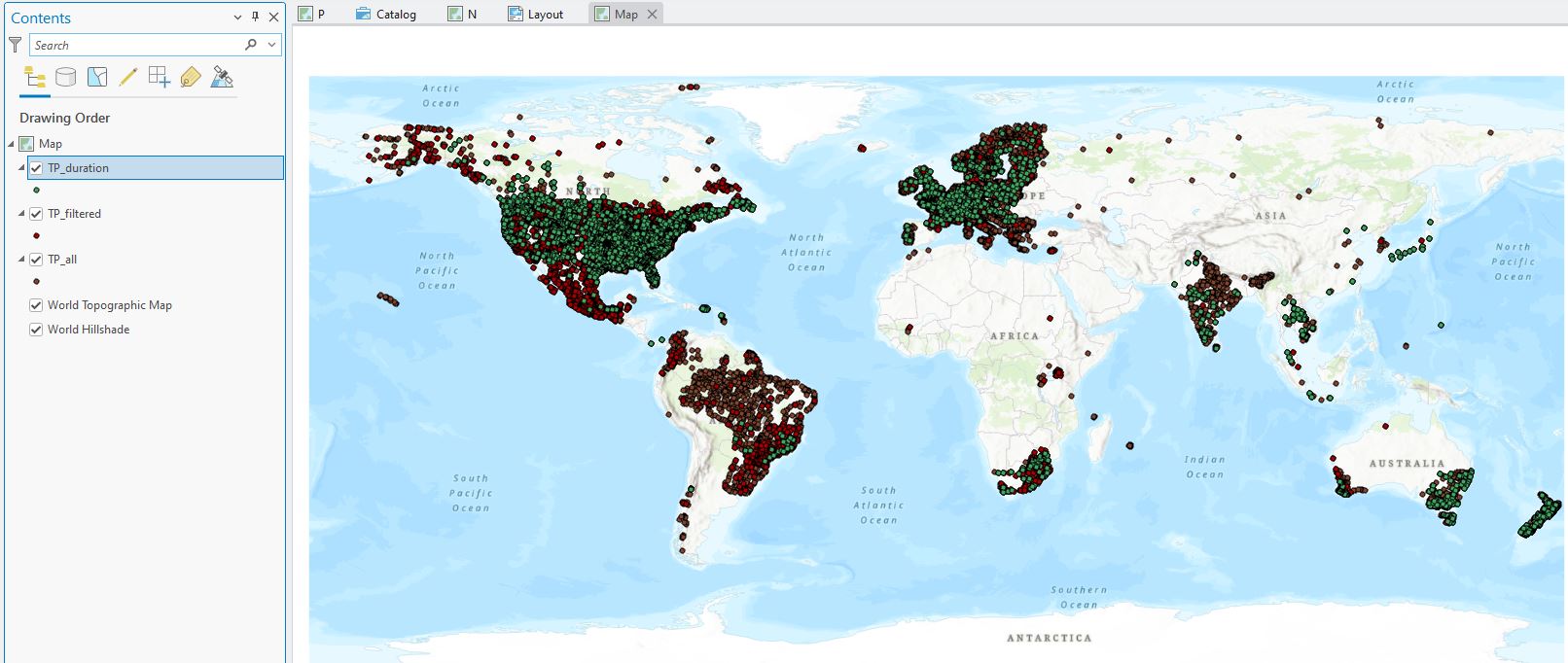
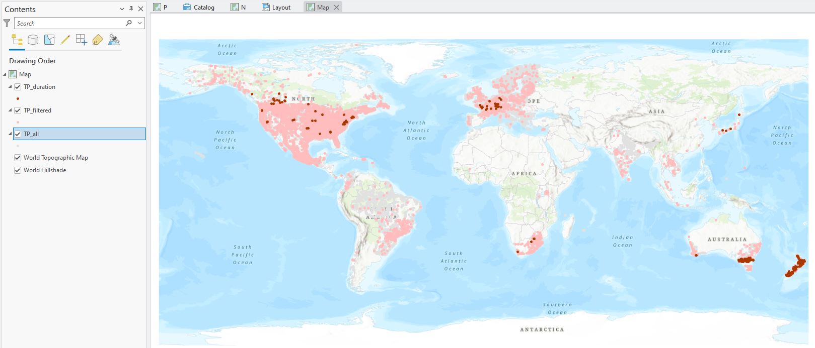
Clearly we’ve got some issues here. An overview of the three layers:
- TP_all: 48,529 points with TP data;
- TP_filter: 14,224 points that also have a flow gauging station in the same catchment (using HydroBASINs data – available on J:);
- TP_duration: 7,328 points with durations greater than 1 year. Note that the points above are showing all durations.
It’s not at all clear which points are which, made more challenging by a few other factors:
- When added to a map, new layers get random colours by default, so there’s little rhyme or reason to showing the relationship between these points;
- We need to limit the TP_duration points to periods of record > 20 years only;
- The sheer scale of the map makes it hard to show a lot of detail with the points.
Let’s handle the durations first. There are two ways we could handle these:
- Use Select by Attribute to find all the records with the right durations and export those points into a new layer, or;
- Use a definition query to only display those that have the right duration.
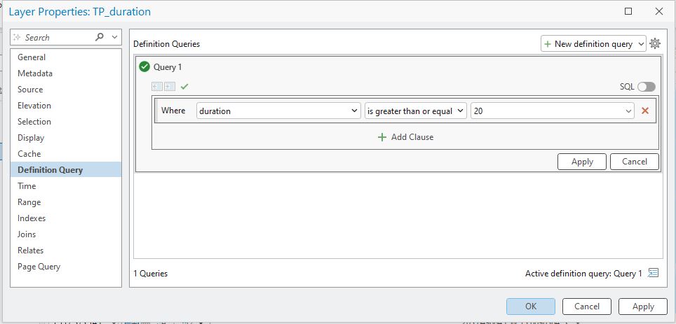
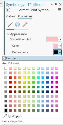
Definition queries can be pretty nifty so let’s use that here. We set these up in the layer properties (right-click on the layer name > Properties > Definition Query):
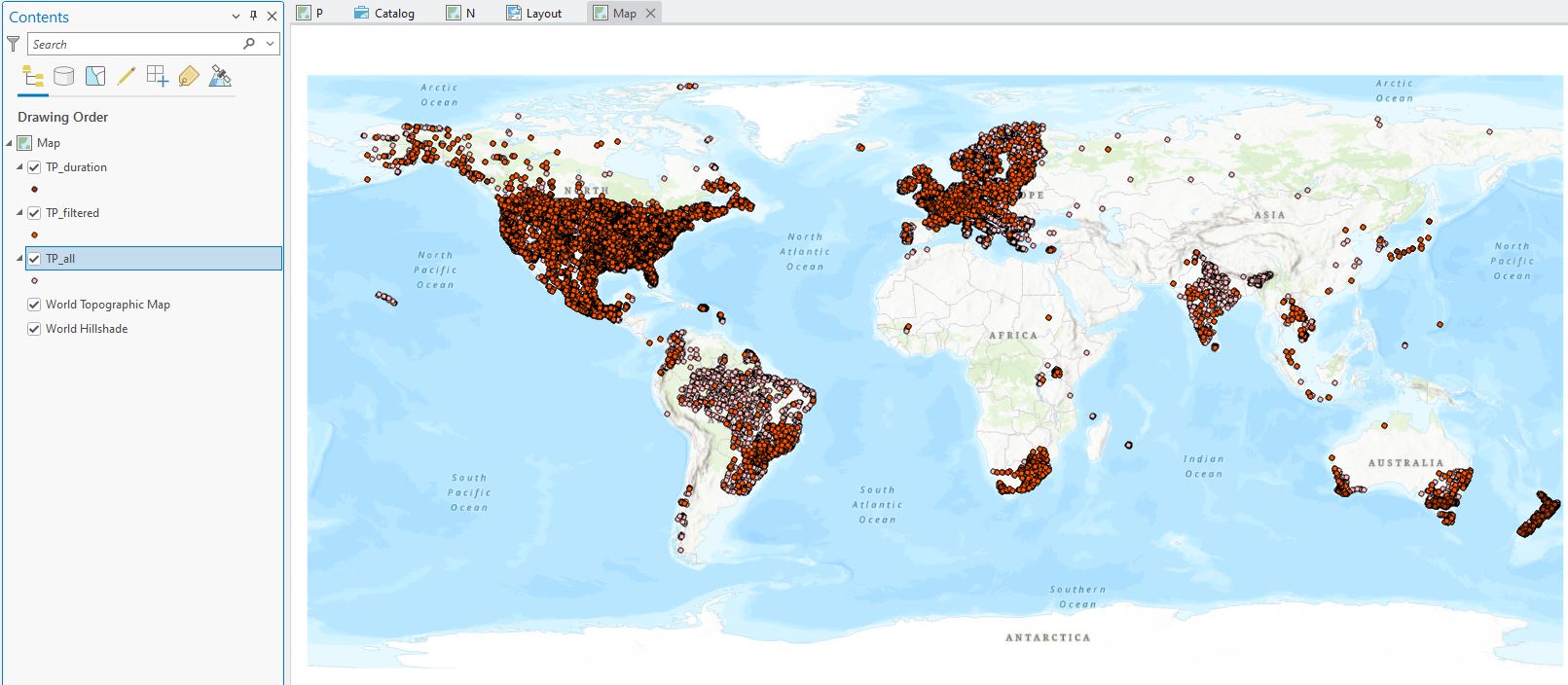
Clicking okay then only displays those points:

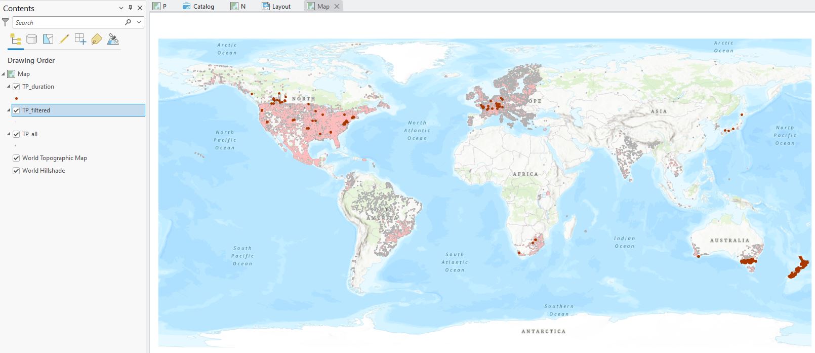
So this tidies things up a bit – far fewer TP_duration points to work with now. Using a definition query here helps to limit the number of shapefiles we have to manage, so that’s one plus.
Next we can think about how to better tell this story using Symbology. These points are related to each other in a hierarchy. We need the map to give us a sense of how they’re related. All points come from the same dataset: TP_all, so any point on the map will have at least one version, some will have two, and some three.
To better display the points I’m going to take advantage of the visual hierarchy. This allows us to use our unconscious way of making sense of the priority of things visually to better design maps. GIS takes full advantage of our wetware’s ability to interpret what we see on maps and images, so it’s really helpful to take this into account when designing your maps. Things like size matter – our eyes our naturally drawn to larger objects and place more emphasis on them. Colour-wise, we tend to pay more attention to darker colours than lighter ones, assigning them more weight. There are other elements which we’ll cover another time (Ed. Oh no, this probably means more posts about this later, right?). Next time you look at a map, or even an image, note where your eyes are drawn to and what you place importance on.
For this map we’ll play around with colour and size to help draw our readers attention to the important things – specifically, how many of the points have long enough durations for use in Jordan’s analysis. In that sense, we can assign levels of relative importance to our three layers:
- > 20 year duration points
- Filtered points
- Unfiltered points
To highlight this hierarchy, I’ll pick colours that range for dark to light – here’s a first attempt (thinking with the synesthesiac parts of my brain – what colour does phosphorus feel like?):
I don’t love this, I’ll be honest. This is a range of reds and the overall effect isn’t that great. The Filtered points are ovewhelming – hard to even see the duration points. I’ll take another tack – the TP_all points layer is sort of just background data – we’re ultimately not that interested in them but they need to be there, so I’ll push them further into the background by making them a shade of grey. This then allows me to make the Filtered points an even lighter shade of red:

Wee steps in the right direction – but I note that what’s distracting me quite a bit is the outline of each point. There’s just enough that it’s overwhelming the points. No problem – I can remove those from the Symbology pane by setting the Outline color to No colour:
With this effect:
That feels like a huge difference – what do you find your eye is drawn towards in the above? That’s the visual hierarchy in action. This is the effect of colour – I’m still not entirely satisfied with this (and also trying to highlight the iterative nature of map making – try something and then see how it looks) so I might mess around with point size a bit (and also make the Unfiltered points a bit darker):
Feeling better – I think I’ve got the sizes okay (for now); duration points are 4 pts, filtered and unfiltered points are each 2 pts, but still not wild about the colours. The > 20 year duration points stand out really well, but the reds aren’t working that great, methinks. People can often associate negatives with reds, so I might go off in another direction with the colours:

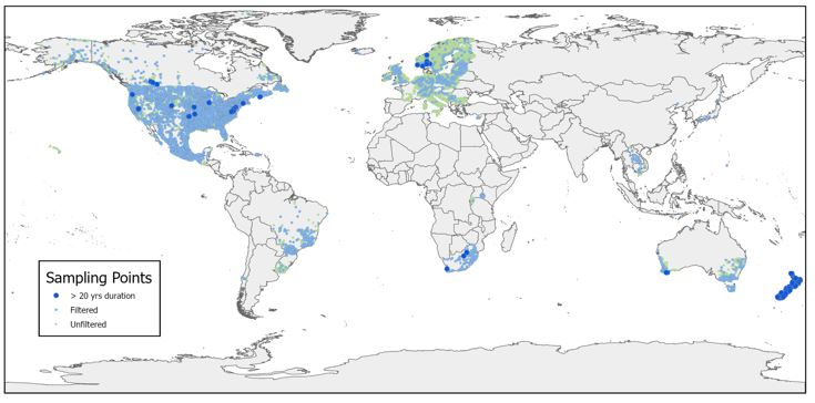
Happier, but it’s still not feeling quite finished – but good enough to send off to colleagues for feedback. So onto a layout for a final map and export to a jpg:
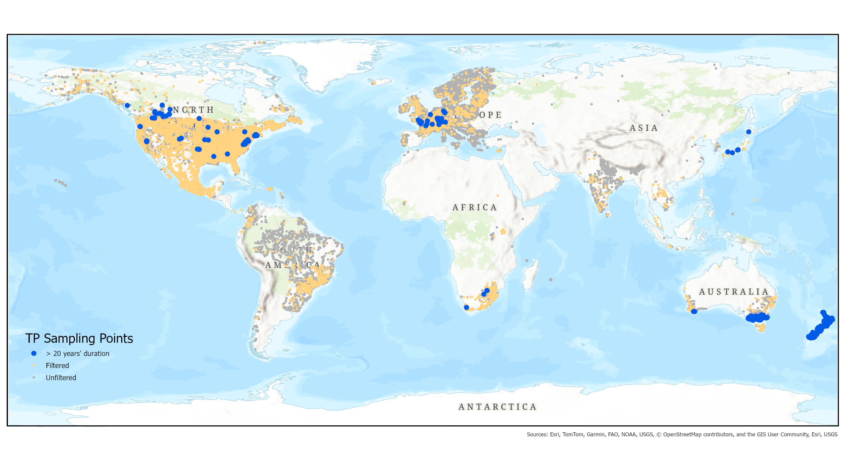
I need to ask myself some key questions before I consider this done:
- Is the map effective?
- Will my reader focus on what I want them to?
- Is it as uncluttered as I can make it?
- Is anything missing for my assumed audience? (arguably, a scale bar and north arrow – we’re still in draft form but I’ll want to think about these more).
Jordan had a go with the TN data:
Some nice improvements here – a simpler basemap that the points can stand out against better, and a box around the legend.
What do you think? I make no claims at being the best map maker in the world (or even at LU, or even in my office when I’m the only one there) and lots of different approaches can be taken – that’s where the arty side of GIS comes in. End of the day, we all want to be creating maps that effectively communicate their message. We’ve looked at just one little map here, but it does bring in some important design considerations that every map maker must face.
Hope that’s been helpful in some way.
C